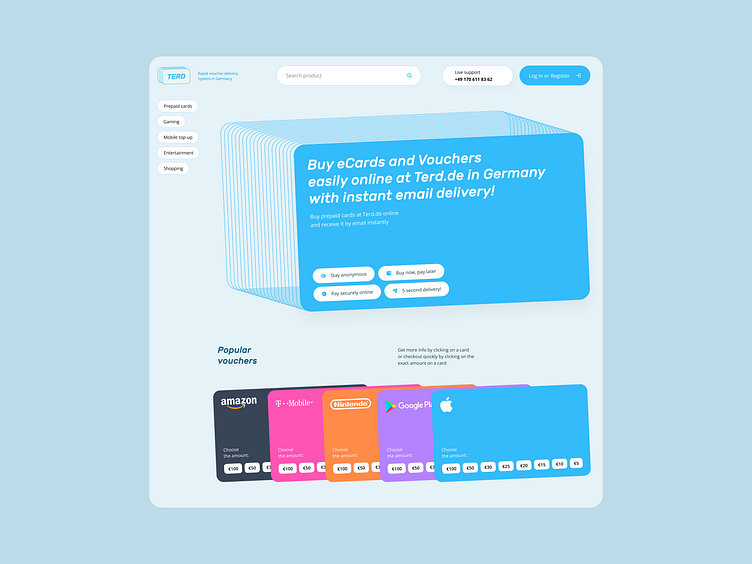
eVouchers webshop: Key visual #1
A concept for eVouchers webshop re-design. A user should feel that it is really easy to buy an online voucher online. That's the reason for the airy composition, rounded buttons, tags, input fields, icons, and typography. The graphic metaphor here is a card — quite straightforward, however, it works well with flat colors.
More by Dmitry Chernov View profile
Like
