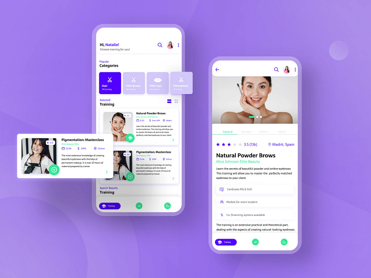
App for selling beauty training courses.
App for selling beauty training courses.
The beauty industry grows every year. The aesthetic medicine market amounts to more than $80 billion in 2020! Nowadays, more and more people want to be trainers in the beauty industry. In every country, the process can be different, but overall being a trainer is somehow easy to achieve.
The Problem
The problem is: How to find clients (students) in this big competitive world? People that are investing in marketing, make money. Expenses of marketing, social media management, etc. especially in Central/East Europe are too high for small businesses, so only a few can afford that.
The Idea & Solution
The client assumed that the beauty training courses aggregator will be a perfect fit for the market needs. They want to create a place, where a trainer can offer courses and find clients for a couple of dollars. That assumption came from his experience because they run an aesthetic medicine clinic with trainers in one of the biggest European cities. They realized how hard, expensive, and time-consuming is to find clients for training courses.
The team was consistent of React Native Developers, Backend Developers, UX team, and two User Interface Designers. Because of my previous experience with UI Design and social media marketing in the beauty industry (I run a small social media agency “after hours”), I was the perfect match for this project as a UI/UX Designer.
The Challenge
The main challenges, we facing from the beginning of the project was:
Creating as simple as possible MVP, but with a modern touch.
There are no competitors on the market at this moment, so the product is innovative itself, and we don’t have research about other products.
The client is not a technical one, so the description of the ideas and features has to be as simple and as “human” as possible.
That third subsection gave us a hard time and showed us how important it is to communicate with real people. But we learned our lesson
The main function, that I highly recommended was:
– Access to the app without registration. Because of my previous experience in the beauty industry and app development, I know that most of the target will leave the app, without registration (even if it’s useful!)
So, we created a user journey that allows the user to search, checking details, and reviews of the training. The last step – buying the training course required creating an account or logging in.
To shorten this last step, the app allows users to log in via Facebook. (more than 90% of the beauty specialist has an account here, if not – they will definitely do not understand the idea behind this product. )
Lo-Fi wireframes got very effective appreciation from the testing users. They easily landed on the desired views, made the conversion, and were aware of taking actions with the product. The client has a strict budget for testing, so we decide to “hire” his employees again. They say that 5 users will find 85% of the app problems – and I agree with that.
After wireframes, it’s time to start working on real, digital mockups. We used brand company colors. Neon green and bold, vibrant purple looks very modern and fun. Fit the requirements and was delightful for the eye. Because the project was in the rush, we considered using native components. We talked about that with the client, and they decided that they want to create a great innovative product, with custom components.
At the first stage, I wasn’t able to create animations and micro animations. That one has to be postponed. But during the excellent development process, I have got a green light for that one
Animations and micro animations were highly important to me – first as a designer I like pretty things, second as a person that should care about the user, I know how they appreciate that. But it has to be implemented very well. Sometimes, users consider animations as a pain point, and they don’t know what is happening on the screen. So, being aware of that, I created only a few :)


