Mail Opt in
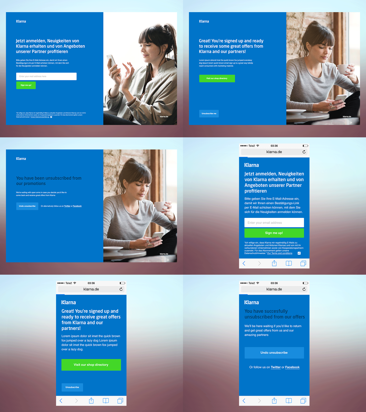
Simple stand alone mail marketing sign up page. In the German market we are required to provide a double opt in process to be allowed to sending marketing communications to consumers (such as promotions, campaigns etc). I thought it was a nice opportunity to work a very simple and smooth UX flow. A good and thought through UX for a simple process like this can add a lot of brand value.
1. User lands on sign up page via promotional banner (e.g. on homepage)
2. User inputs mail and agrees to terms and conditions
3. Screen shows that a mail has been sent to them in which they need to hit the confirm button (button allows them to resend the mail if necessary)
4. User goes to their mail and signs up via the branded mail we just sent them
5. They're all done! Legally we are also required to give them the option to unsubscribe at this point.
6. Unsubscribe flow, encouraging them to feedback on why they want to unsubscribe, as well as encouraging them to switch to twitter or facebook.
