Sennheiser Site - Redesign
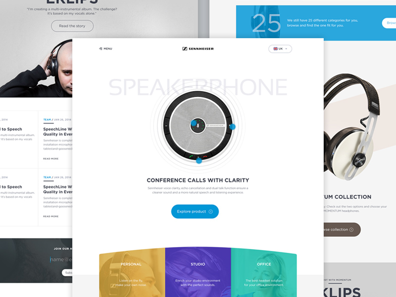
It's been a while since my last UI post. So here it is, a visual UI landing page for Sennheiser. I think it's a natural move for Sennheiser to improve their site.
On this landing page, the user would see the featured product, divided by some top categories, get the sense of special edition series "momentum"
I attached the full view + stupid sketch.
Press L if you like this, feel free to leave comment and follow me :)
________________________________________________
More by Budi Tanrim View profile
Like


