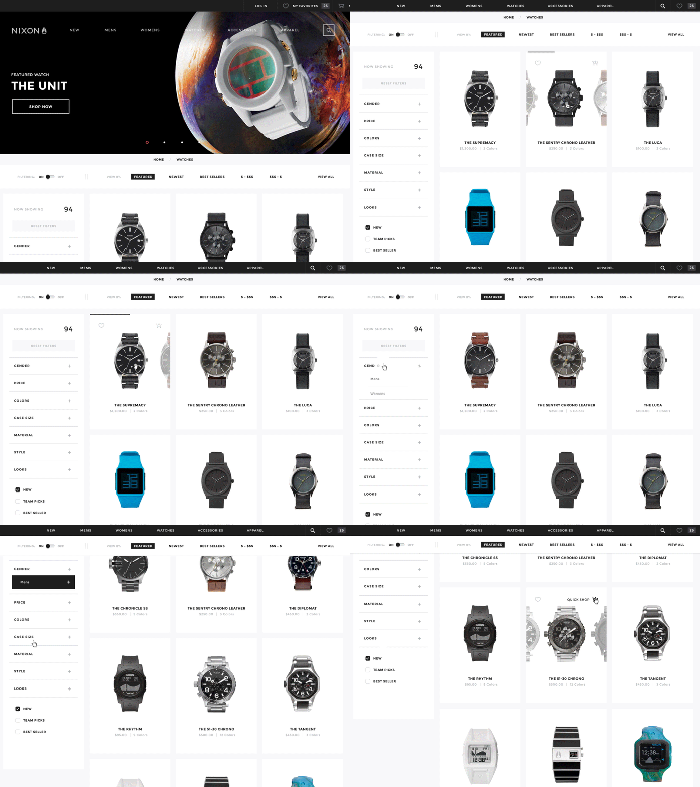
Nixon Product Category Interactions
At BASIC as part of my time on the Nixon redesign last year, I worked on the interactions on the product category pages. Getting the interactions to work took a lot of collaboration with Nixon's internal team to make sure all their product needs/requirements were met across the entire line, and then with the development team to make this work properly through all touch points. There's a lot more to be said about the interaction that was achieved through lots of testing and collaboration, but check the case study for some more details. To me, this was the highlight of the purchase flow as it really helped enhance the shopping experience in a unique way.
As a view in to the process, I included some redlines and product module interaction mappings, along with a super super quick animated gif done as the original proof of concept to try and initially sell-in this interaction.


