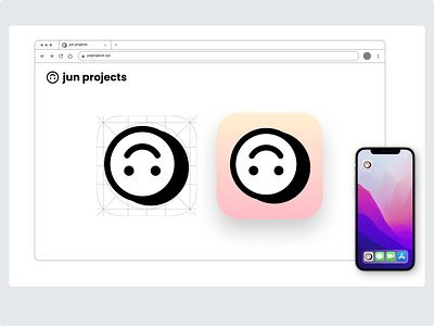
App Icon | Daily UI Design Challenge 005
Daily UI Challenge | Day 005
For day five I was tasked to design an app icon.
I chose to get creative using my loosely designed personal brand 'jun projects'.
Being a 90's baby and loving the resurgence of 90's nostalgia I drew on this as my inspiration for the style.
I created an offset black background for the upside-down smiley face logo giving the design a classic '90s clipart feel.
When I think of the '90s, I think of gradients. I chose a soft yellow and pink gradient that inspires warm and comforting feelings. It reminds me of the peach-flavoured Japanese gummy lollies (iykyk) which I loved growing up.
The design for the home screen icon features a combination of soft background colours and bold black lines, creating a visually striking contrast. The white fill of the upside-down smiley face adds to the icon's appeal, making it stand out among other app icons.
To ensure the app icon is legible and recognizable at a distance or at smaller sizes, I also tested the design as a favicon. The branding remains clear and distinct even at the reduced scale, eliminating any confusion for the user about the blurry image.
Let me know what you think
