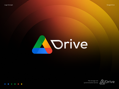
Google Drive Logo Concept
Hey Dribbblers!
This is a Google Drive logo design concept I did just for fun using an unused sketch from a past logo design project.
___
Contact us to get your logo design or branding project done:
A sleek and modern redesign of the Google Drive logo, which breathes new life into the familiar and iconic brand identity. The redesigned logo features a clean and minimalistic design, with a simplified color palette and bold typography that enhances its visibility and legibility.
The logo is comprised of two elements: the wordmark "Google Drive" and a stylized graphic icon that represents the concept of cloud storage and file sharing. The wordmark is set in a custom sans-serif typeface that is both modern and approachable, with letterforms that are optimized for readability and consistency.
The redesigned logo is versatile and adaptable, with various iterations and applications that allow it to be used across different platforms and contexts. For example, the logo can be used in its full form with both the wordmark and icon, or it can be used as a standalone icon without the wordmark.
Overall, the redesigned Google Drive logo is a stylish and effective example of logo design that updates and modernizes a classic brand identity. Its clean and minimalistic design, combined with its bold typography and simplified iconography, make it a standout example of effective logo design in the tech industry.
