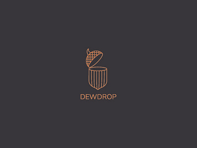
логотип для студии дизайна интерьеров DEWDROP
DEWDROP - interior design studio. It provides a huge range of services, which includes: the development of interior solutions concepts, their implementation, cooperation with interior goods stores. Also, this studio trains its employees and produces textbooks for interior designers.
The logo consists of a sign and a font part.
The sign depicts an acorn with a slightly opening hat, which symbolizes the wealth of ideas that the studio can offer, as well as all the accumulated knowledge acquired and giving their students.
Oak is a powerful, strong, perennial tree, which is why it was taken as the basis of the concept. DEWDROP studio has been on the market for a long time and impresses with its quality.
The font part of the logo uses a grotesque. The precise smooth lines of the font, without serifs characterize the brand as strong, reliable, time-tested.
