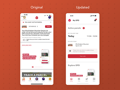
DPD, what's going on here?
The DPD app is very weird...
So I had a parcel being delivered today, and to track it I downloaded the DPD app... it's a bit of a mess. For some reason the home icon is a popcorn cart, and the history button is a bonfire, if that does not throw you into a heap of confusion let me know.
Now, the icon choices may just be for bonfire night (I certainly hope so), but the app has more UX problems than that.
A block of text is not easy to extract information from
"View" button does not explain your action
The tracking number "1597...." is not particularly
Package history doesn't seem like a major option, so probably doesn't need to be in the bottom nav bar (in the 'more' page makes more sense).
I would think most people come to track a parcel, so let's make that more prominent.
I took a little while to update the UI, users should now be able to skim the parcel page more easily, and not be overwhelmed by text and very colourful icons 😂.
Let me know if you think I made an improvement!
