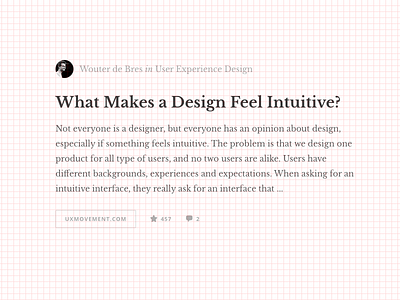
Chapter view grid
We are working on an all new Gibbon website, it will be more focussed on the content and on sharing chunks of knowledge with your team. One of the choices we made is that we use a 12x12 block grid.
Currently aligning the chapter view with the grid.
Please note, the grid in the shot is only used for design purposes, not visible in the actual design :-)
More by Gibbon View profile
Like
