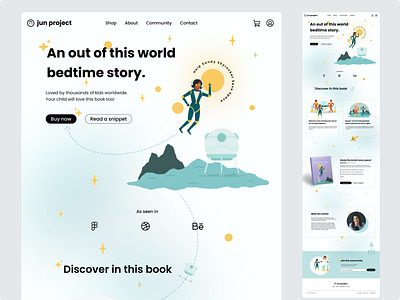
Childrens Book Landing Page | Daily UI Design Challenge #003
Daily UI Challenge | Day 003
For day three I was tasked to design a landing page.
The concept for today was an e-commerce landing page for a children's book. I had a pretty clear vision of how the landing page would look but coming up with a concept for a children's book in addition to the landing page really wrinkled my brain. This challenge really pushed me creatively.
The illustrations were pulled from an illustration set called Hyperspace using the Figma plugin 'Blush'. Shout out to the artist Mathew Wong.
When designing the landing page, I kept two key user groups in mind: children and parents. The playful illustrations and fun styling were carefully chosen to create an engaging and enjoyable experience for children. However, it was equally important to consider the needs of the parents, who would ultimately be the primary decision-makers and users with the financial means to make a purchase. I aimed to balance the needs of both user groups to create a landing page that is both accessible and appealing to children while being easy and convenient for parents to navigate and make a purchase.
To help lower the barrier to purchase and increase engagement with the book, I have added a feature called "Read a Snippet." This allows users to preview a portion of the book, creating a sense of intrigue and a desire to learn more, ultimately leading to a commitment to purchase. As an added value, every purchase includes a free download of the audiobook and complimentary access to the E-book, providing even more value to our customers.
To enhance the user experience, I carefully incorporated design elements such as blue dotted lines and a galaxy-like gradient into the background of the landing page. These elements not only add visual interest but also serve a functional purpose. The blue dotted lines act as a subtle guide, directing users' attention and leading them seamlessly through the page, while the gradient adds depth and movement, drawing the user's eye across the design. Together, these design choices create a cohesive and visually appealing user experience, making it easy for users to navigate the page.
Something new I learnt was creating arcs using the ellipse tool. I got lots of practice using the pen tool to create curved lines. I also had fun creating gradients using the ellipse tool and blur effect.
Overall I am happy with how the design turned out. If time wasn't a constraint, I would make some changes to this design. One addition would be to include a testimonials section for more social proofing. Seeing positive feedback from other customers can help to establish trust and credibility with potential customers, making them more likely to purchase.
Let me know what you think.
