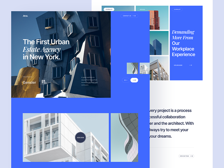
Arca - Architect Agency Website
Hello Dribbblers!👋
Today I am going to share a project for an Architect Agency Website. I combined Inter (Sans Serif Font) & Playfair Display (Serif Font) but still managed to make it look professional and elegant according to their website theme. I also use blue to make it look fresh, the layout is also unique to represent that they are also experts in architecture.
----------------------------------------------------------------------------------------------------
Overview :
A business’s online presence, regardless of industry, can have a massive impact on its success. In this day and age, some companies still don’t realize that a majority of their customers will visit their website before making a purchase.
Having a strong online presence, particularly a website, can be a make or break for generating more revenue. Yes, the "quality of your website" impacts results.
Why Do Architect Agencies Need a Website?
The good news is that there’s a solution out there that will work for you. Here are the top reasons it’s essential for your business to have a website :
1. Credibility for your Agencies
2. Can Build Personal Branding
3. View your Organic Traffic
4. Saving You Time + Customer Service
5. Website also can be used for Digital Marketing
What do you guys think?
Feel free to share your thoughts in the comments!
I hope you enjoy it! Don't forget to press "L" if you like it! ❤️
----------------------------------------------------------------------------------------------------
**See the full preview on the last slide**👇👇
We are available for your awesome projects!
Affordable and satisfaction guaranteed. Just shoot us an email at info@slabdsgn.com and let's chat on Skype
------------------------------------
Check our product 🚀
Creative Market | Envato Elements | UI8
Follow us for more cool stuff ✨


