Plum Wine Appliance: Embedded Design
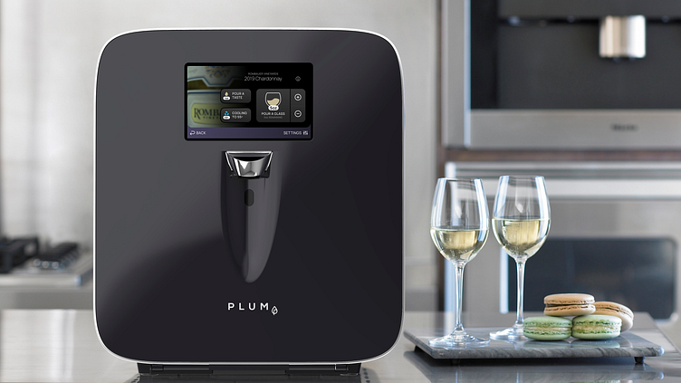
Plum, which offers the first appliance to preserve, chill, and pour wine by the glass directly from a bottle, brought me on as Lead Product Designer after a successful introduction to the home appliance market. While the device itself boasted best-in-class hardware, the user experience was lacking.
Plum's internal workings provided plenty of opportunities to impress wine drinkers without making them do much work themselves. Its dual chambers cooled or warmed a bottle automatically to the recommended temperature for that varietal based on a database lookup using the bottle's label, captured via the HD camera inside each chamber. Motorized needles would then pierce most bottles, preparing them for pouring wine. And as each glass is poured, Plum replaces the wine with argon gas, which perfectly preserves the remaining wine for up to 90 days.
Improving the Existing Experience
Before jumping into a redesign, I took the opportunity to recreate the existing Plum experience in Figma to see where issues may pop up in each workflow. This also allowed anyone from Design, Engineering, or QA to run a working prototype of the appliance without having to load test software on the actual hardware.
Exploring the Plum Brand
While I was fixing bugs and implementing new features on the existing software, I was also busy exploring Plum and its competitors, as well as other appliance and lifestyle brands. Interfaces and experiences for embedded appliance controls are wildly different, so we did our best not to try and replicate anything we saw, but instead learn from each bit of inspiration.
In an effort to create a sophisticated interface that delights, we often came back to the June oven, which has an embedded screen on the front glass and uses cameras to automatically detect your food and suggest cooking modes/times. I cooked many a meal in this oven over the next few months.
Redesigning the Plum
After exploring moodboards and working through several design iterations, we started to see the new Plum UI come to life. At the same time, we carefully thought through the experiences of pouring a glass of wine, inserting and removing a bottle, and the entire cleaning process.
Previously, the Plum could only pour wine in two different amounts: a taste and a pour. Those amounts could be adjusted in settings, but what happens if someone wants to adjust their pour in the moment? By carefully considering the tradeoffs of adding more features during a simple action, I was able to allow adjustments to the pour just before it started and allowed a 1 oz. "top up" afterwards without overwhelming the user.
Notifications were always buried under a settings icon, then menu, then within individual sub categories in that menu. Instead of making users do a lot of work just to find out what their appliance was trying to tell them, I created a Plum button which would be the hub for all non-pouring actions. This included notifications, which could come alive on the main screen and lead users to the action they needed to take in a more visual way.
Accessibility Included
As I used the Plum appliance over the course of a few months, I noticed several opportunities to improve the accessibility of a device that relied solely on a touch screen. While there wasn't any haptic feedback available in this iteration, both the speaker and the screen provided a chance to provide more information to low vision users. After some research, I put together some information for the Engineering and Product teams to consider in future versions of the software and hardware.


