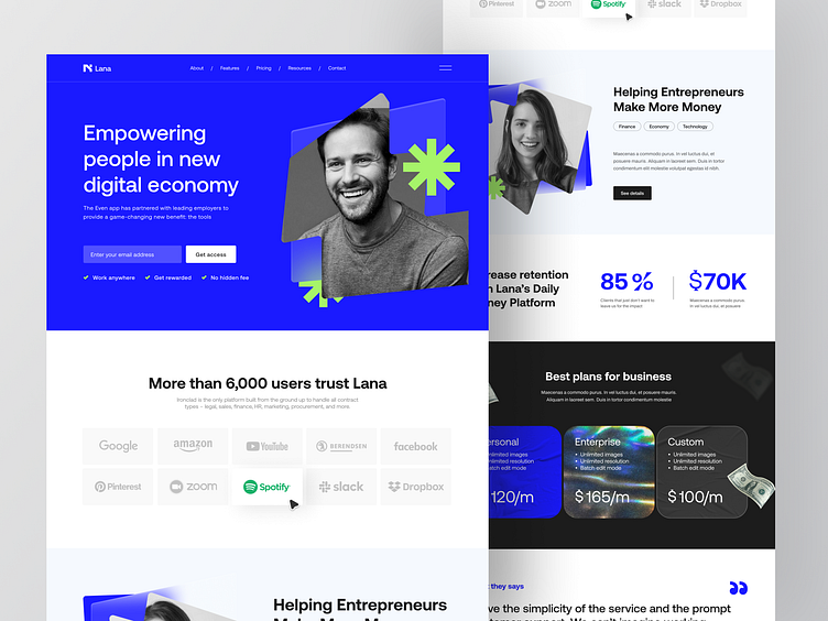
Lana - Finance Website Landing Page
Hello Folks! 👋
I’m excited to share my case study of a Finance Website called Lana. This website explains how we can empower people in the new digital economy.
I create shapes with glassmorphism style and I combine them with holograms as well that will look modern visually.
Full Page
Typography & Color Palette
Thankyou for scrolling! 😉
Interested in partnering with us? Say hello at hellodama@odama.io or visit our website odama.io
Check us more at:
📷 Instagram | 🛒 Gumroad | 🎉 Figma Community
More by Odama View profile
Like


