Big data web app
Overview
This is a monitoring and diagnostic tool for telecommunications networks. It is a B2B web app for internal use in large Telecom companies. The end user is the technical staff of these companies whose goal is to monitor the overall performance of the network and spot possible deficiencies. The app provides a wide range of insights to help them do so.
The objectives of the project
Give an overview of the network performance
Help with spotting problematic nodes of the network in order to repair them
Help with diagnosing anomalies in the performance of the network over time
Help with spotting sources of network overload
My role
In this project I was in charge of all the design aspects. Everything presented here was executed entirely by me (UX Research, UX Design, UI Design).
UX decisions
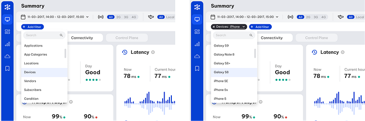
One of the project’s difficulties was that it is highly technical and demands specialised knowledge. A lot of discussions and questionnaires with/to the stakeholders were required to understand the concepts involved, to clearly define the scope of the app and to translate it into a structured and insightful tool. The main feedback came from technical staff of existing Telecom clients. The communication with them was indirect through the Product Manager. The Product Manager had a Telecom engineering background, so he was able to provide valuable information as well. The communication with the backend engineers of the development team was also a very big part of the process, since the feasibility to display every piece of filtered data had to be checked with them.
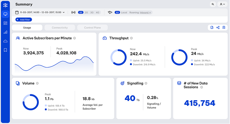
The parameters that turned out to be the most basic and frequently required were placed on the most prominent position and with a single-click access (second top bar). These are the date/time picker, the network type (2G/3G/4G) and the roaming options. Supplementary to these, I designed a filter bar for adding extra filters (third top bar). Apart form the accessibility reasons, I placed these parameters in this prominent position to imply the fact that they are global configurations for all the sections of the app.
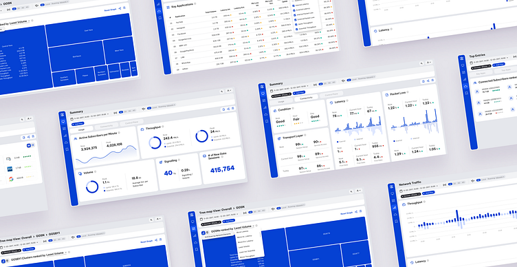
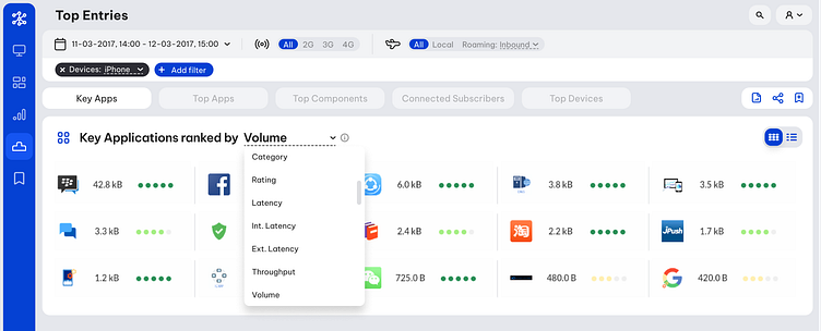
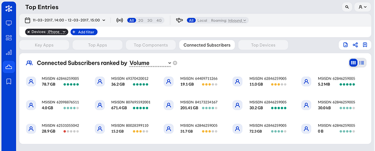
Out of the huge volume of metrics we were able to show, I tried to extract from the stakeholders the most important ones, categorise them into three families (usage, connectivity, control plane) and present them as clearly and concisely as possible. The purpose of this process was to create a dashboard as the landing view of the app, presenting some quick and rough insights on the network.

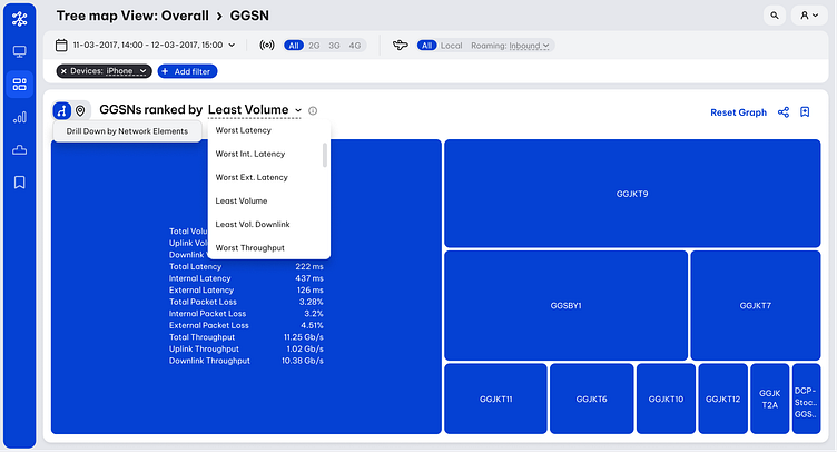
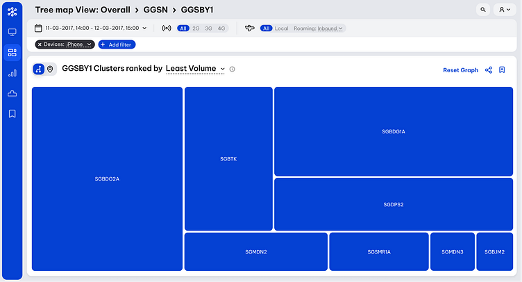
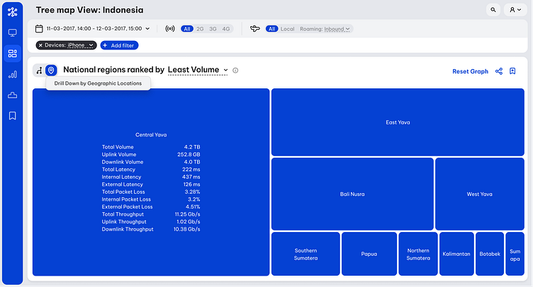
One of the main objectives of the technicians was to spot deficit nodes of the network. I approached this task similarly to code debugging, by isolating big parts of the network, check if they contain a deficiency, and if so, repeat the process by drilling down into that specific part, until the deficit single node. I decided that the best way to visualise that is through a tree map. The node parts classification was done both per node clusters (purely technical), but also per geographic areas.
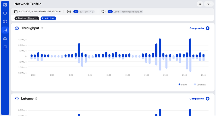
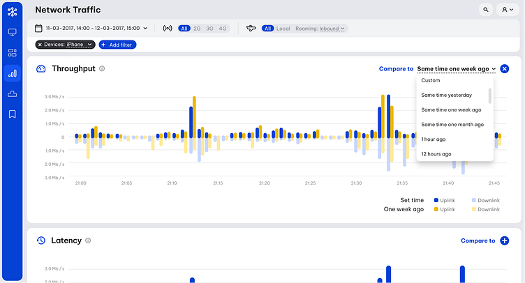
Another important function of the tool was to relate network deficiencies to external events (e.g. fires, earthquakes, accidents). In order to do so, a visual overview over time was needed. So, in this section all the main metrics are presented as time-axis graphs in the selected timeframe. A compare functionality was also designed to help with spotting deviations from regular metric patterns (e.g. compare the current data volume to the respective of the same time one week ago).
Another approach for spotting anomalies in a data set would be to simply collect the highest and lowest values of an object as per each of it properties. So, the purpose of the next section was to present these highs and lows, organised in five categories.
Finally, since each view is highly customisable with many options for filters combinations and time frames, I suggested that each parameters combination can be “bookmarked” and stored in the last section of the app for quick access. There are also options to extract each dataset into CSV/JSON files and share a customised view.
UI decisions
Some noteworthy UI decisions:
Due to the professional and technical profile of the users, I chose to create a minimal and plain GUI (as little shadows as possible, no gradients or any kind of heavy visuals).
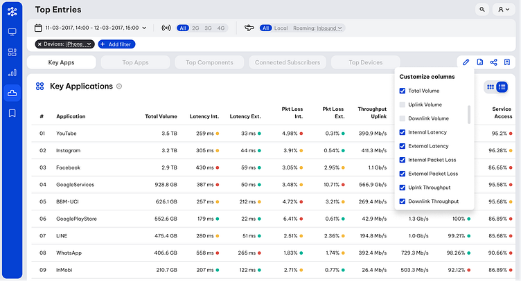
The big amount of numeric data in the dashboard views was challenging to handle. There was definitely a need for visual demarkation of all the pieces of data in groups and subgroups, in order to help the viewer instantly recognise their relationships. I decided to do that with white panels on grey background and further separate them with subtle borders instead of solid coloured boxes, in order to reduce the number of lines that would make the view too busy.
For the sorting options of the data, I used select boxes integrated into the panel titles. This way the selected option of the select box, looks like an organic part of the text, making it also a more intuitive way of selection, as it is the closest it can get to natural human language.
I used a solid colour for the main action buttons, directly related to the functionality of the app, while for the supplementary actions (export, share, save, edit) I used outline buttons, so that they stand out less and are visually distinct actions.