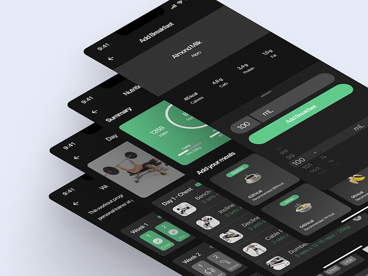
Fitness & Gym & Diet Mobile App UI Design: Gymnax
Hey everyone!
I shared my previous design, this design is a continuation of it. I am sharing it in this way because I designed it piece by piece.
The Gymnax app is actually an alternative to card entry for Gym owners. You can pass through the turnstiles by scanning the QR code. With the request of the application owner, I added features such as a Workout programme, and diet tracking area.
If you like my design, you can show love by pressing "L" <3
In this area, we divided the gym's member-specific workout programme into weeks. We make up the week from 6 days because the gym is open 6 days, but we also had to add 1 day as a mandatory rest day.
Each week is divided into days according to the muscle groups in the body. You can see the detailed training programme by clicking on the relevant day.
You can see how movements can be done both with video and animation.
You can also easily track your progress with the progress bar.
In this area, there are nutrient macro values prepared by the dietician of the gym member.
From this page, the user can add their meals and see their nutritional values etc. and follow them.
I am available for your exciting projects!
💌 Let's Talk at: egebese@gmail.com


