Annotations in Sketch Web
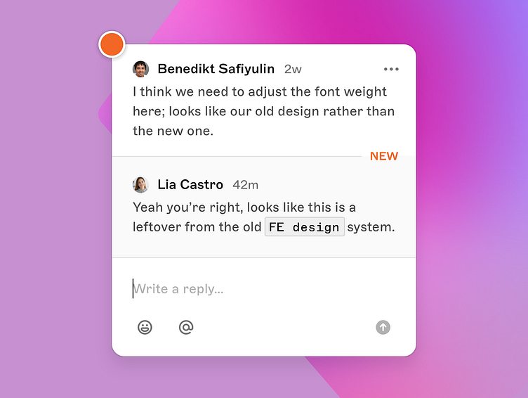
You may have spotted it already — we’ve recently redesigned commenting in Sketch. Comments now directly live on the canvas as a pin with their own threaded conversation.
Read more about it on Sketch’s latest blog post.
Comments on the Canvas
Each comment thread lives on the canvas for a better context. As before, the sidebar continues to provide a good overview of all comments on a given page now with a tweaked look and feel, and soon a filter.
An orange dot means it’s a new comment or a comment has a new reply. Gray dot’s indicate that everything is read.
During the continuous iteration and internal feedback, I’ve redesigned the popover to have a smaller footprint and to emphasize that every thread starts with a comment followed by replies.
Mobile Optimizations
As Sketch’s web app is optimized for mobile, we had to ensure commenting works fine on smaller screen sizes as well!
Bottom aligned modal sheets, bigger buttons as well tweaking hover states to always accessible actions, ensured commenting is optimized for mobile.
Acknowledgements
Of course this whole project was a massive team effort! So, huge thanks to Nico for laying out the awesome foundation and first iterations of that project! Also thanks to Glenn for all the feedback and support.
And last but not least big thanks to my awesome collaboration team that made this feature actually happen. 🧡


