This Could Have Been an Email
Dribbble Product Design Certificate Capstone -
Desktop Email Application

My mind at this point in the class is all over the place, the dog walking app, building a resume, applying for jobs, and still working at my current job. This product truly was a way to escape. As I have used Intercom in my previous position, could see my mom using a more casual email application, and have been known to draft some pretty strongly worded emails, I felt like this was a great passion project.
In this Capstone Case Study, I’ll walk through the thought process, development, and evaluation of this design.
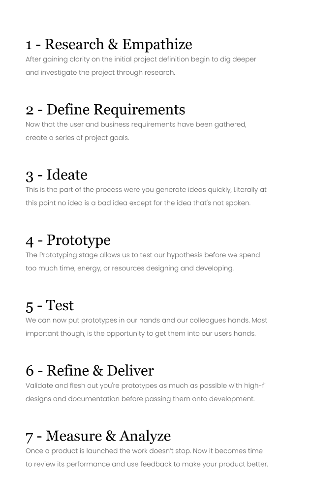
Assignment
Using the research and user persona given, create a desktop email application that helps solve the problem.


Added Research
In addition to the user persona and research already completed, I also completed competitive research and found that automation and canned response are features, but the focus. Outlook has a lot of features, which can be overwhelming. Gmail has just as many but in a sleeker UI. Intercom you’re able to add gifs, and the conversation is more text-like, but you have to download a plugin to add your canned responses. Teams you’re able to call, able to text and attach files. But you can’t schedule or add canned responses. There is also not many organization. Slack has channels and private chat, however, the barrier to entry may be difficult for clients. Definitely a great internal option for a team.
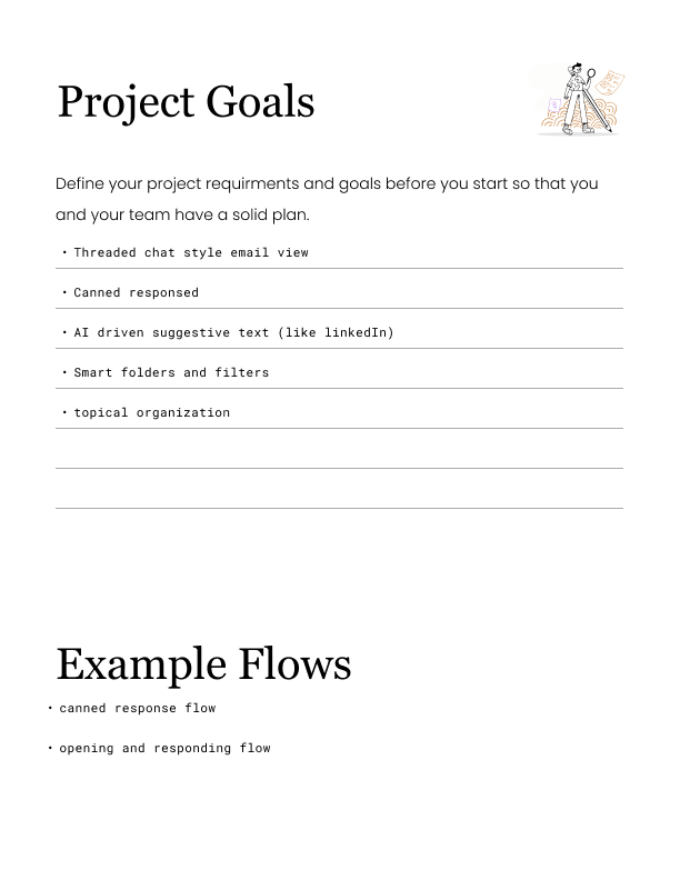
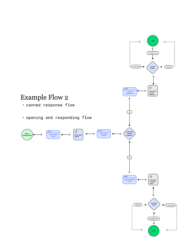
User Flow...s
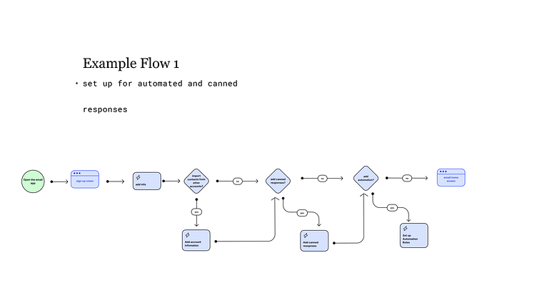
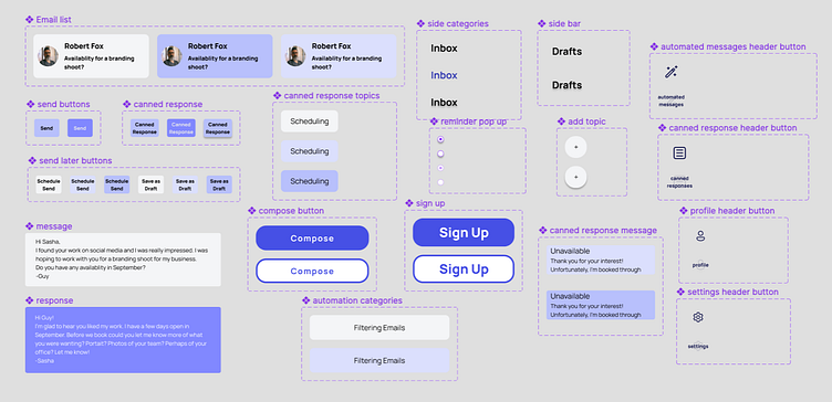
Flow 2 goes through the email process; opening up an email, deciding whether to use a canned response, saving it as a draft, scheduling to send, and sending the email. I felt like this was all fairly intuitive by adding those features to the email text box. However, as shown in flow 1, I wanted to make the setup for canned responses and automated messages
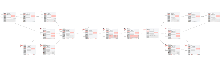
Wireframes
The basic wireframes for flow two came together really well.
However, I had many discussions with my mentor about how to best add automation and cut down on time for the user. Flow two alone doesn't exactly solve the problem. Time would still have to be spent creating those canned responses and automated messages.
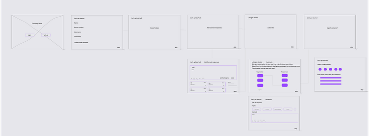
Prior to the current iteration, I thought the sign-up would be where you could add automation and canned responses. This is shown in Flow 1, the sign-up. I also created a few sign-up wireframes but felt stuck. After some discussions with my mentor, I realized that this may create a bit of a barrier to entry. And a different solution would have to be made.

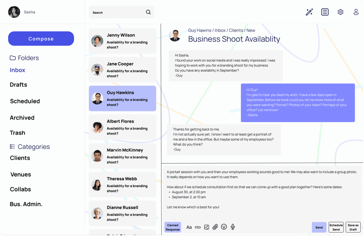
App Design
The Email App could use some fine-tuning (auto-layout, alignment adjustments, and some copy modifications) but I really like the concept and functionality.
After thinking about automation and time spent in the inbox, I decided to add automation and canned response icons to every step in flow 2. These icons would lead to pages to update or add responses as the user would see fit.
I ended up going with this solution while I was creating the initial sign-up wireframes, I kept thinking, "the user may not know how they want to automate a message, or what type of response they will be using often." and I asked my self, "how can this be added, edited, updated, and organized easily?"
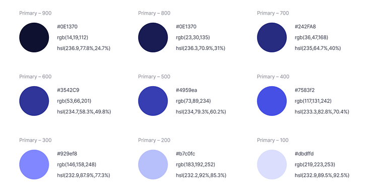
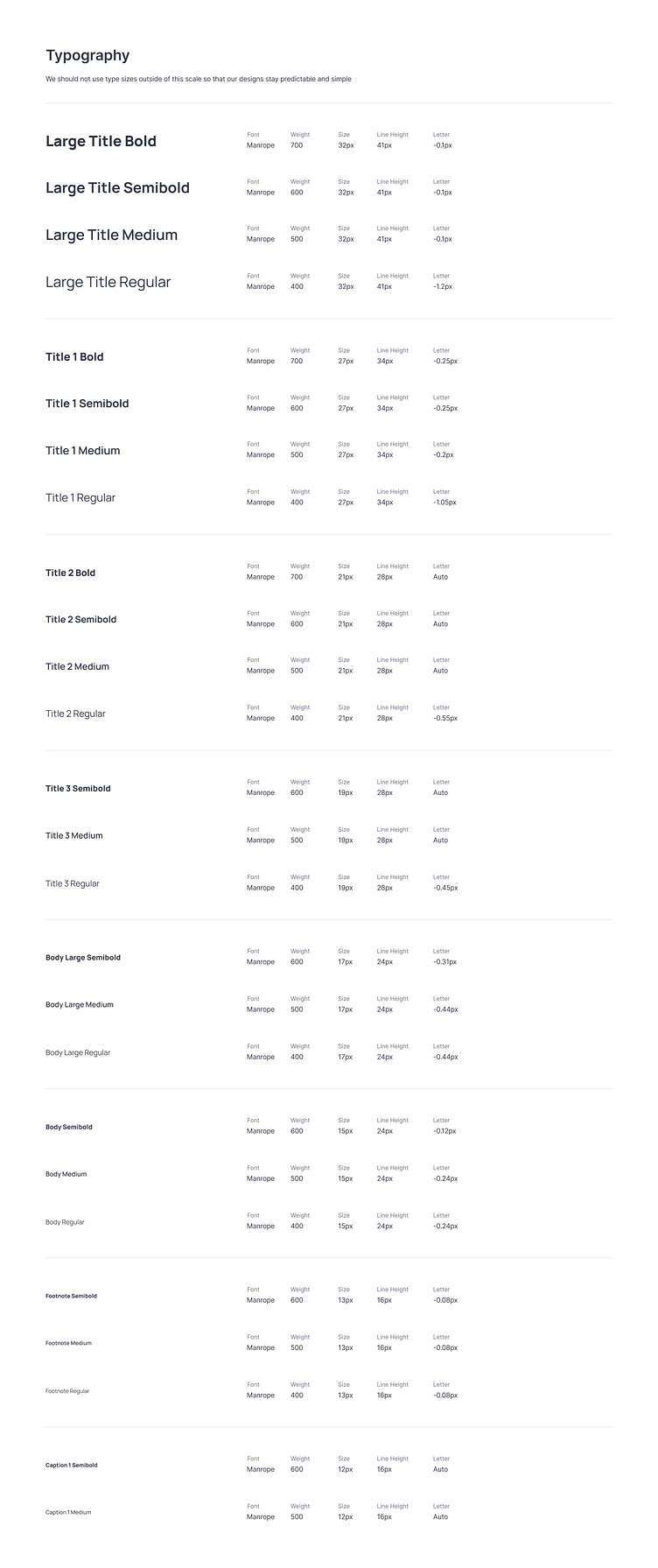
Design System Components
The colors and typography were provided. There were many additional color options that I incorporated into the background of the app. I wanted to make simple color choices, but have a muted background full of different colors to create a fun and interesting experience without being distracting.

Outcomes
I'm currently in the testing phase. Because the research portion was already completed, I'm curious to see how the product will be received.
