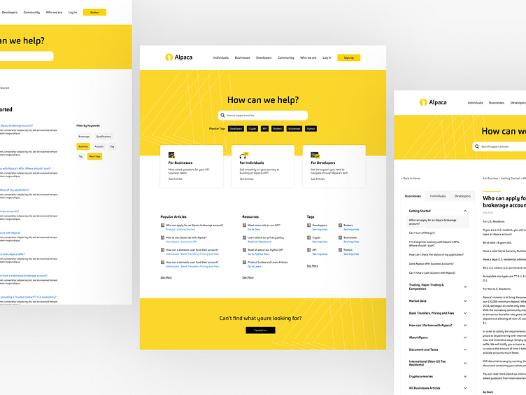
Alpaca FAQ
Alpaca is a company that builds API for crypto and stock trading. As a growing business, the dynamics of its operations must constantly be re-evaluated to meet their users' needs.
The Problem Statement
As a result of the company's growth, it's become clear that the target audience has evolved to fit two persona types: Brokers and Developers. Brokers are the corporate and business audiences. Developers consists of the individual programmers, traders and cryptohead community.
Alpaca's FAQ/Support page no longer simplified the search for its users with all the forums being generalized. This case study will highlight what solutions were obtained to improve the UX of Alpaca's Support page from research to high fidelity mockups.
Competitor Research
Alpaca vs Robinhood
Alpaca's Support page resembled Robinhood's the most out of all its competitors. Both the Support Homepages were organized into categories. When a category was clicked into, they cascade to that category's page and its topics. Finally, once a topic was clicked, the desired forum page appeared.
Though the flows were similar, Alpaca's UI felt more cluttered due to the redundancies of the topics being shown under the category page and in the Table of Contents (TOC). To improve this, inspiration was drawn from Robinhood's TOC behavior where the topics would be hidden under the category tab when the user was at the main category page. However, the topics would be expanded when a user has selected a topic and is on the topic page. This also strengthens one's breadcrumb navigation.
Coinbase & FTX
Coinbase and FTX had the same main flows as Robinhood and Alpaca's pages: support homepage, category page, then forum. However, Coinbase and FTX lack the TOC feature. We wanted to keep this for users to have multiple ways of 1) knowing their location 2) easy visibility and access to related topic forums.
The way Coinbase organized their Support Homepage was a step in the right direction for how Alpaca needed to categorize their product forums by user-type. They became the main inspiration for how we were able to solve our need for user-specific categories for our support forums.
Stripe & Kraken
These two had the shortest user flow going straight from their Support Homepage topics to the forum. Their page prioritized the topic search feature which would be great to have as an option on top of strategizing organization by categories.
Plaid
The infinite scroll for Plaid's support page was ideal to optimize website SEO, however, it wasn't within the workload capacity of our developer to accomplish at the time. This would be a feature to consider for future updates.
Other Big Companies
Branching out from our direct competitors, we can see similar FAQ trends in other big companies. Referencing their pages, we start to see UI trends for the design of other successful companies to get inspired by which leads us to the moodboarding.
Moodboard
With UX improvements comes the UI and design factor. Alpaca underwent a brand refresh in May 2022 so the Support page would be one of the first pages to establish the new brand standards of the company's visual refresh.
Here we can see the initial splash of color on the page's hero banner section is a favored trend that would show off our Alpaca yellow brand well. From there, the category cards and layouts would follow a grid-style organization, which was also applied to our page's layout iterations.
Iterations
Several iterations were made in collaboration with the Design Director and developer until the main flow and design was established from the Support Homepage, to the persona page, to the forum page.
Next Steps: Other User Flows
With our developer's work capacity maxed, the release of our Support page update was put on pause to prioritize other projects. Moving forward, the next steps would be to understand the content and page flows for users to search for topics by Popular Articles, Resources and Tags.


