MF with Heart For MedaFill
Hello Everyone.
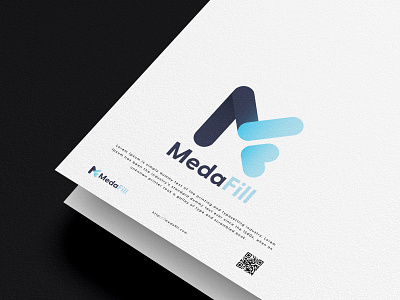
This Logo for "MedaFill"
Logo design contest winner on 99designs by Vista. Check here
-
The combination of the letters M and F that blends nicely. If you pay attention to it. I slipped the heart inside the F. instead of the all too common "+" among pharmacies. The heart symbol also has a healing meaning.
-
Shape meaning:
Straight: for alertness, professionalism and dexterity.
Round edges: for gentleness/friendliness of service.
-
Color Meaning:
The choice of a dark blue color that has the value of trust, experience in handling, and a light blue color signifies vigilance in the medical world that emphasizes responsibility for the trust given. The light blue color can also mean hope for healing.
-
Press L if you like it. Thanks for the appreciation.