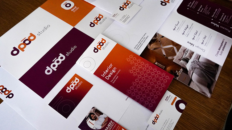
dpod studio - Branding: logo design, visual identity
dpod is an emerging online brand with 20 years of experience under another name. It also needed a unique appeal to break away from the old brand image and reach more decisive customers.
dpod stands for DESIGN PODIUM, a company where that designs spaces meticulously and provides a pleasant living space under budget, an ultimate goal that the brand aims for. To communicate the brand identity, the specified design principles are embodied in the brand design essence and consistently applied to multiple touchpoints. It's an essential component of the design that provides dpod its unique voice and style, successfully expressing the brand's positioning in the marketplace.
The logo is presented as a Symbol. Here, the symbol serves as a distinctive identifier, allowing the lettering to remain effective and readable. In order to increase the legibility of the full brand and have an impact on the online platform, the writing is separated from the symbol. This enables the Logo to keep its consistency over a significant period of time.


