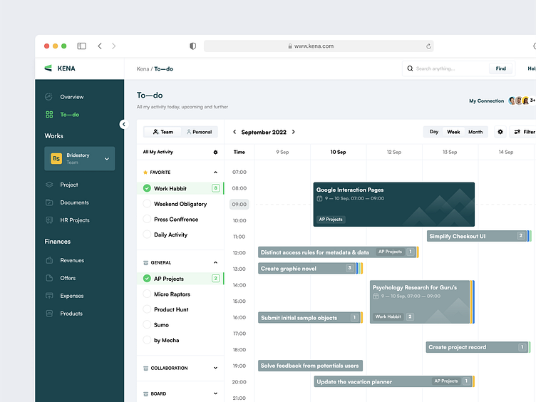
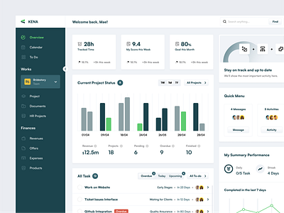
Kena - To do Page
Hello guys 👋
This shot is a rebound from my latest shot, Here’s the details! 👇
Full Preview
Here's the detail of our design project. Check it out!
Quick Design Explanation
Here's our quick explanation of this section. Check it out!
How → Main todo is listed as a timeline calendar, perhaps can help users easily scan the time and get quick information of what should the user do in a day or in a week in 24 hours. Then, the user can select the to-do card to see more details or even complete their sub-task.
Note: I made a minor change in the sidebar menu, as I already observed Calendar can be shown in to do a page by selecting the Month tab menu, so I remove it.
Wireframe & Brand Guideline
The following wireframe and brand guidelines are used in our design projects.
Thank you, Interesting to collaborate? ✌️
We're ready to solve your problems and collaborate with your product. Let us know and say hello at hello@dipainhouse.com
Dipa Inhouse is a creative digital design and development agency. We provide high-quality services and help you to find solutions in UI/UX designs that are intuitive and represent your business goal.
Website • Instagram • Products • Contact Us


