My Branding
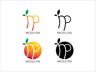
Using the shape and curvature tools to illustrate the original design of the logo (bottom left). The "np" initials were engraved onto the orange object with pathfinder tools. Four versions are made of the logo to accommodate for viewing in multiple media. The bottom logos are designed for representing the brand's visual completely while the top logos are catered to a more minimalist approach. Black and white versions of the logos are designed for simple purposes such as email signatures. Font used on the text is Bilo.
