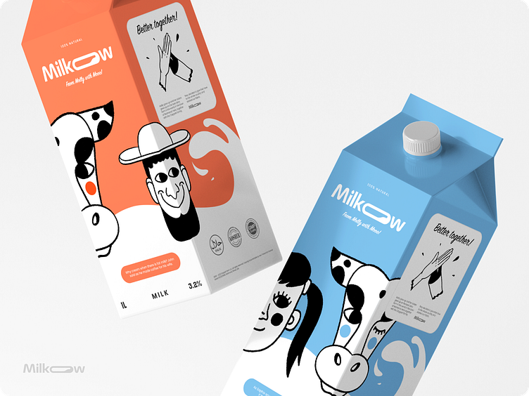
Milkow - branding and package design for a milk brand
The package should encourage people to buy!
Meet Milkow a milk brand.
The name is a combination of the words "milk" and "cow", which is easy to read, and immediately carries a descriptor.
Logo concept
The font logo uses the fluidity of forms to emphasize the fluidity of the product, and the letter O, curved and stylized as a container with liquid, acts as an identifying element in the logo, also, a dot above the letter and stylized as a drop of milk.
How it started - portraying the brand's story
Once upon a time, during a flood in the city of Redmond, I wandered the streets in search of shelter and came across the yard of the Clappett family, hiding from the flood in a shed near the house.
In the morning, while examining the results of the night's downpour, I was found by Grandma Clappett, she went into the barn and saw a large, spotted cow innocently huddled in the corner of the nursery and sleeping, an absurdly small bell with the inscription "Molly" glittered around its neck.
Grandma carefully came, sat down next to me and ran her hand over my big, shiny, pink nose, I woke up from the tickle, I saw Grandma Clappett's charming smile, then I knew I was in good hands and licked Grandma.
Thus began this story, many years have passed, and neither Grandma nor I are alive, but there is a large, family dairy farm of the Clappett family, on which my brothers and sisters live and thrive, and which is looked after by the descendants of Grandma Clappett: her son John, his wife Minnie and their children, Sophie and Jamie.
And although I am no longer with you, my love remains in every drop of Milkow milk, so enjoy the taste and give warmth to those around you, and Grandma Clappett and I will watch it from the milky heavens and enjoy your every smile.
From Molly with moooo!
The packaging concept
The illustrations depict the characters of the Clappett family and Molly the cow herself, the illustrations are arranged in such a way as to create a kind of constructor on store shelves, where part of the face of one character complements the other, thus broadcasting a strong family bond between them.
In addition, each character and product has a small thesis from Molly, for example:
Milk 3.2% - character John, quote: "Why cream when there is fat milk?", John said as he made coffee for his wife.
Lactose-Free Milk - Minnie Character Quote: "No lactose - no problem", said Minnie over a glass of milk with cookies.
Milk 2.5% - Sophie's character, quote: "What is a morning without milk?"
Such minor cues are designed to create in the consumer a sense of the reality of the characters and a sense of kinship and similarity with them. This is due to the similarity of the problems of the characters and real people, as well as the gender and age distribution of the characters, we can see individuals of both genders and different age categories, which expands the potential audience that the product can target.
Brand - emphasizes the value of communication, contact and integrity. Broadcast not just an image, but a whole story, which can potentially be used in advertising products, particularly in commercials.
The general image is pleasant, calm, not ambitious, and loyal to everyone and everything.


