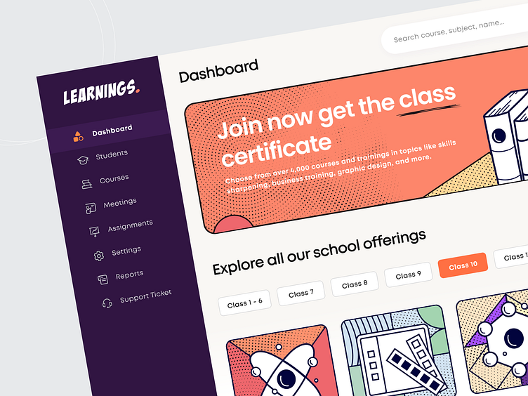
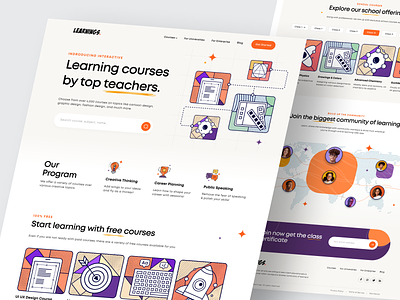
E-Learning Dashboard
Hello Dribbblers,
Have you ever wondered if your E-Learning website UI could be artistic and modern - away from dominating professional blue color that creates an amusing scrolling effect yet falling into the line of professionalism?
Maybe NO!! But that can be possible! Our UI design artists always experiment with designs and color schemes. And this time, we came up with this very appealing modern, retro-comic vector-based, yet professional E-learning dashboard UI design, which can offer your learners a modern website user experience, especially the artistic color scheme and typography.
The E-learning dashboard design and the placement of each design element shown in this image allow students to easily navigate through the app and keep track of their progress while planning the learning schedules with the help of calendars and reminders.
Isn’t it amazing to try something new and get your unique position in the market as the most creative and powerful e-learning platform?
Feel free to share your thoughts in the comments 💬.
Press "L" if you like ❤️ it.
----------
Have an awesome idea? 💡
We will provide a quick analysis and free proposal for it.
Don’t worry, it is secure and confidential.
Contact us or Email us or Skype us : biz.mindinventory
Explore our more work here


