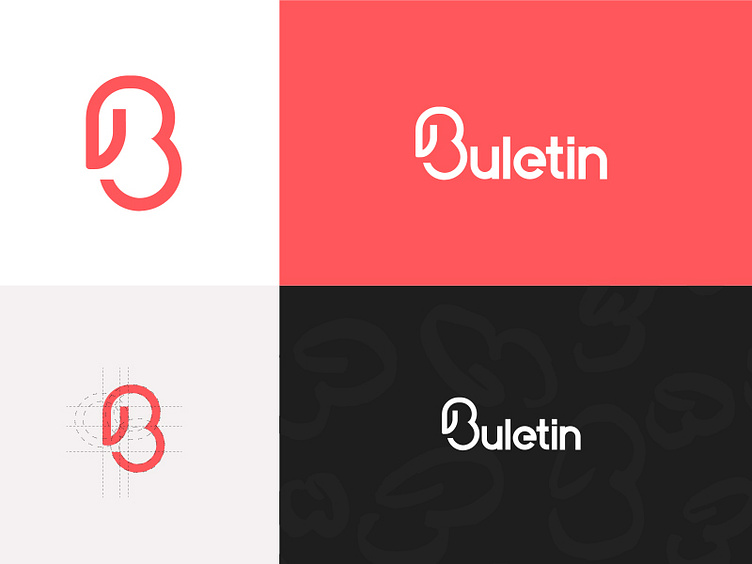
Buletin new logo!
We decided to go over one more redesign of the logo. I am kind of happy where this is going. Needs a bit of retouching and fixing edges in some letters.
Basically the logo is just the B but tried to come up with letters for the rest of the name.
Many people will say this is similar to another logo. It is so rare to make an identity that is not similar to another one. We think this is unique and gets into the purpose of our project.
Feedback much appreciated.
Go and and Press = L
More by Fabric View profile
Like
