BORING
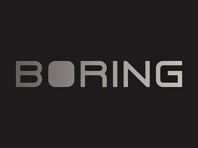
Some custom type, i’ve been enamored with rounding fonts lately (removing all sharp corners), and have been experimenting with crafting my own. Here I used it to reimagine the Logotype For The Boring Company, turning the more playful word-mark into something more industrial (something more boring).
More by Micheal Johnson View profile
Like
