Views Tools - Helping product teams speed up product delivery
The long-term product vision
Enable design in production as part of the day-to-day delivery process.
Secondary goals:
Create an intuitive collaboration environment for everyone on the product team.
Create one source of truth.
My role:
Lead product design
Create the design system
Implement front-end
Create interaction layer
Create documentation
The process
Design Thinking, Jobs To Be Done, and Now-Wow-How-Matrix.
Definition and feature prioritization happen in loops based on user feedback.
We prototyped in code and released changes in a continuous deployment pipeline. We were engaging with users and the community via a dedicated Slack team asking for feedback and scheduling interviews.
Empathize
Key insights:
Existing development environments are too complicated for non-engineers.
Designers want to contribute but can’t adopt the tools.
Cross-functional teams build highly optimized solutions.
Ideate
Key insights:
MVP iterations
V1. Panels - simplified website editor.
V2. A visual editor focused on the artboards.
V3. IDE focused on building interfaces.
V4. Figma plugin - next iteration focused on interaction design.
The Key-Value pairs
Key design insights:
CSS, HMTL, and Javascript have different syntax.
Bugs are often implemented due to missing or misplaced punctuation.
Unifying and simplifying the front-end syntax marks the beginning of Views programming language.
The ultimate solution is to clean up most of the markup and make the properties as intuitive as if they resemble an interface properties panels.
Quick create
Key design insights:
The creation of new projects bares many complexities.
The ultimate solution is a one-click new project setup.
One-click install
Key design insights:
Dependency updates are not intuitive, and running them is tedious.
The most intuitive solution for designers is an automated update when the master branch requires it.
The most flexible solution for the engineers is a manual update.
The ultimate solution is to combine both.
One-click start
Key design insights:
Starting a React app requires one or two commands, but for most designers dealing with the Terminal daily is too much trouble.
In some cases, multiple processes have to be started at once in multiple Terminal tabs, which makes the process even more cumbersome.
The ultimate solution is to automate the pipeline and start all processes in the right order to allow instant editing.
The Horizontal And Vertical
Key design insights:
The flex-box model requires a lot of upskilling and practice.
Flex-box direction property makes more sense as a distribution model, excluding the main and cross axises.
Views is the first framework introducing the concepts of Horizontal and Vertical, leading the way for Webflow and Figma.
The State Tree
Key design insights:
Browsing nested files and folders is one of the most common action performed when developing interfaces and typically takes a lot of cognitive effort.
The state often becomes complex and co-dependent.
The ultimate solution is to unfold the tree horizontally instead of vertically in a pattern inspired by the columns view in Finder.
The Together and Separate
Key design insights:
State management flows are hard to follow.
The ultimate solution is to simplify the state concepts and provide a flexible framework focusing on design patterns.
I came up with an abstraction on top of ReactJS where interface elements can be toggled on and off by displaying them together or separately, with navigation actions linking the separate states.
Components
Key design insights:
There is a hard-to-close gap between the engineers and designers since designers usually don't have access to code.
The ultimate solution is to enable the access and creation of new components as part of the shipped software.
Designers should be able to iterate directly on working product to become more efficient in their creative decisions and to learn how the product works.
Click to navigate
Key design insights:
It's time-consuming to find a component in the code without searching for its name or browsing folders and files.
The ultimate solution is inspired by Chrome dev tools - the file opens in a new tab after clicking on the component in the working app's interface.
In addition, CMD click opens design system components in the new tab to save up searching time.
Bridging the gap
Key design insights:
Development environments are full of abstract commands and hard-to-remember shortcuts.
As one of the ways to close the gap between the engineering and design worlds is a frequent commands dropdown.
Branding
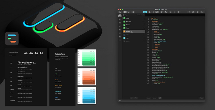
One of my usual responsibilities when designing a new product is to create a compelling and contextually aware brand. This isn't a typical app since it involves IDE design patterns and code highlighting.
Core visual elements include:
Vivid energetic colors.
Code highlighting consistent with the brand.
Logo based on the state management concept.
Custom iconography.
Feedback and testing
Key insights:
Code has to be secondary.
The use of javascript logic and data has to be more intuitive.
Code contribution over git has to be part of the design process.
Here's the link to the Views compiler for the curious and ambitious ones!


