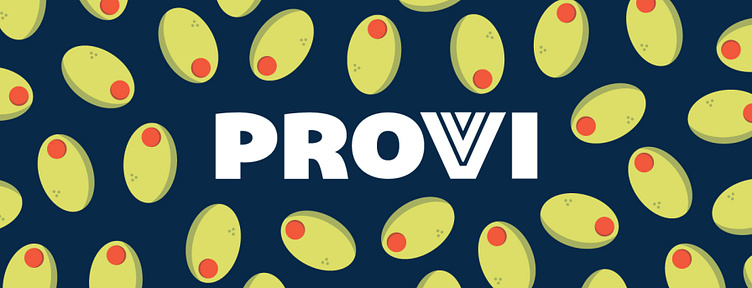
Provi - Brand Identity
Provi, a digital alcohol distributor needed new brand positioning, identity toolkit, and brand guidelines — so we raised our glasses to the challenge, rolled our sleeves up, and got to work.
The wordmark “V” nods to the industry's three tiers and to the idea of the glass always being half full. A strong logomark we call the super “P” logo gives a cape-like appearance to the hero brand.
Vintage illustrations give a human touch to the brand's identity.
Thanks for watching!
Like what you see? Check out the full Provi Case Study and our entire portfolio of work.
More by VIA Studio View profile
Like


