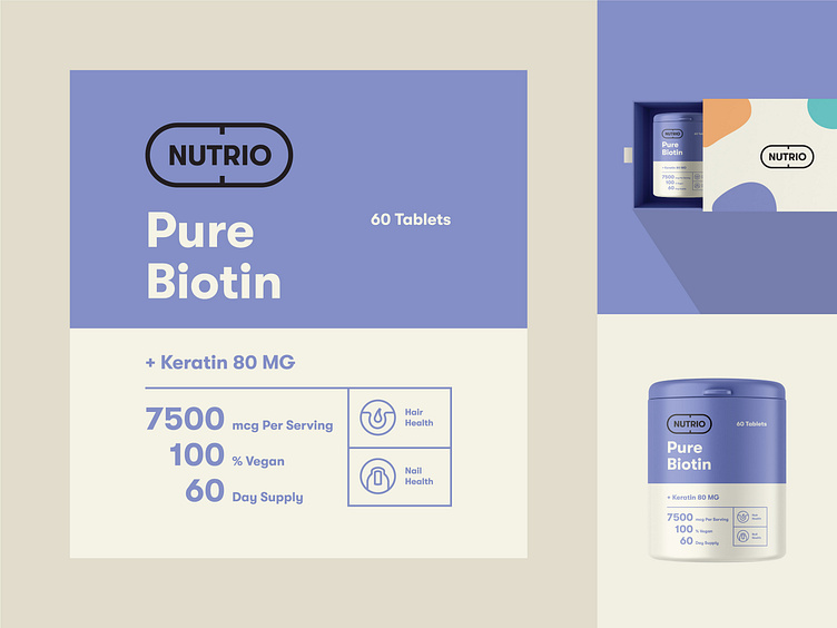
Packaging design for Nutrio Supplements
How to explain to people the positive ➕ sides of the product on the label in a modest way?
Most people need a visual presentation for better comprehension🤓. That is why we use icons to send an understandable message✉️. At the same time, using bold font highlights essential points and draws attention to the right place👀.
And last but not least👆🏻, the logo says a lot about the product as well. Having a meaningful logo, such as Nutrio's, explains the product’s nature💁🏻♂️.
More by Marka Works Branding Agency View profile
Services by Mustafa Akülker
Like


