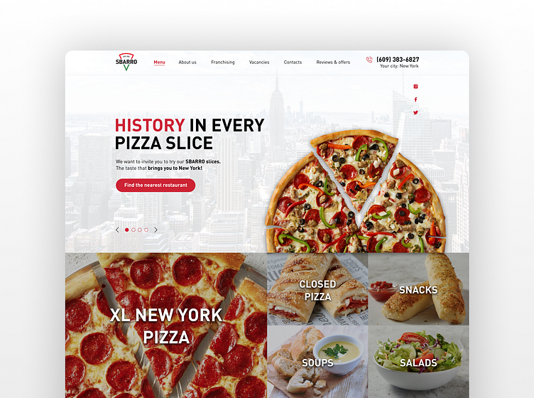
Sbarro Pizza | Pizza restaurant franchise website design
A bit of Sbarro's background
Sbarro was established in 1956 in New York. By 2011 Sbarro was 5th by size pizza restaurant in the USA market, and in 2020 they entered the UK market with 15 stores. Sbarro is still a vast franchise growing throughout the whole world.
Initial task
Sbarro has reached out to me with a task to design a website for their new franchise. Keeping the visual attribution of the brand and the initial roots of the company's culture through my design was crucial to keeping the UI close to the corporate's visual identity.
UX Research
My first step was to analyse the main website of Sbarro: https://sbarro.com/
If you go through their original website, you will notice that I used similar visual elements in my design. Still, their website got old in terms of both UX and UI, and it barely solves users' problems as everything seems messy, and most of the elements are just out of place in terms of UX.
After a couple of meetings with stakeholders and telling them about my feelings about their main website, we decided to keep it as a source of inspiration but with an option to design a new website according to my design vision to make it more modern-looking and convenient.
Competitors analysis
I also went through the websites of popular pizza franchises such as Domino's, Pappa John's and Pizza Hut to highlight their pros and cons and implement their best UX decisions into Sbarro's website.
I also analysed their target audience, which is people that I mainly in a rush and want a quick snack on their way.
UX Wireframing
With all the data about the company, its competitors and its target audience on my desk, I started designing low-fidelity wireframes to develop UX solutions. I created a particular order of web sections to keep convenient information consumption throughout the website.
Visual communication and UI
I kept the UI of the project close to the brand's culture and the original roots by placing images of their authentic restaurants and information about their history. Also, I didn't turn away from their original style and improved their visual side by making it more modern and refined.
Happy stakeholders
In the end, I sent my mockups to the development team, and all the stakeholders were happy about the website's final version.
Want to Turn Your Ideas into Design?
Email me at resetnikovs.aleks@gmail.com
I am always available for a quick chat over...
Whatsapp +44 7734 236137
Telegram https://t.me/aleksreshetnikov
Follow me on:


