Journalist Portfolio
Mălina Mîndruțescu is a reporter for Panorama, a Romanian multimedia business journalism platform and a fact-checker & researcher for Lead Stories, a US media organisation. She is also a Marcin Król Fellow at Visegrad Insight, the main Central European platform of debate and analysis. Her writing also appeared in Foreign Policy, Sifted (a tech and startups publication backed by the Financial Times), Balkan Insight, Focus Magazin and Good Beer Hunting among others.
The challenge
The challenge was to create a new website, with a different structure than the old one. It needed to be very usable, with a clear information architecture and beautiful, original, completely custom user interface design. For this we completed this checklist:
Visual identity: modern, fresh, professional and original to reflect Malina’s unique storytelling techniques;
Detailed Resume
Usable, beautiful and original blog post layout
-
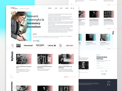
Clear information architecture: emphasize the publications she wrote for, the featured articles and the bylines, integrate Romanian and English articles, integrate internal and external articles
UI Design & Development
1. Typography-based and abstract branding & UI
The logo is a wordmark, bringing the attention on text in order to reflects Malina’s profession. Clarity and minimalism reflect her writing style, while expressive lines, colors and vertical texts create that originality to reflect her storytelling skills. The font Degular was chosen because 1) it is sans-serif and we want to focus on a fresh, modern feel; 2) it is clear and looks professional and at the same time is also interesting and brave and 3) because it is not widely used. Card images are harmonized by desaturating them and adding a color overlay. The color chosen for the overlay was cyan as it is easy on the eye so can be used repeatedly on the page. On hover, the image gets saturated again. Featured articles have an orange overlay, in order to attract more attention. The vertical headings of the sections have a nice animated effect of getting filled with orange on hover.
2. The custom-made, detailed resume
The CV can be downloaded as PDF or seen in the website. It includes links of articles per each publication she worked for. Because the experience sections is very long, it is in the form of a see more field, with a button which expands it, in order to keep things ordered. Except from the typical fields in a CV (Experience, Education, Skills, Languages) there are also some custom ones (Awards/ honours, Tv & Debate Appearances, Expertise) and others can be added.
3. The special single blog post layout
In order to make the most out of the format of the space on desktops while keeping the width of the text small in order to be more appealing to the eye, we introduced a two column layout, with the text on the right and the images on the left. For the empty space that remains when there are no images, we designed an abstract background made of squares and the motif of convergent lines.
4. The information architecture
The publications she wrote for appear in the hero, before the fold. Bylines appear first in the site so they cannot be missed. The homepage offers a little of every section from the website, making sure the reader doesn’t miss anything. The cards for both the internal and external articles have the same design as it is not important for the reader to know if he is leaving the site or not.
The outcome
The client was very happy with the look and feel of the front-end and admin panel. She noticed an increase in the number of visits, so the new website was a success. Check it out here.