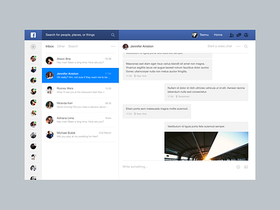
Facebook Messages
Okay I won't even pretend that this is better from a UX perspective. Facebook has such a huge variety of different people using the site that it's just... Impossible for me to imagine a perfect design.
But I've been using Facebook Messages a lot recently and I just can't overcome the fact that the current design neither looks good or isn't even fully responsive.
So I made this little facelift for practice! It's nothing big, just me exploring a bit. Tell me what you think about it! Also I know I didn't make space for ads. Didn't make an effort for that since this was just for fun.
More by Teemu View profile
Like

