Case Study | Virtual Tour App: Gyarari

Gyarari is a contemporary art gallery located in the suburbs of a metropolitan area in Tokyo, Japan. Gyarari regularly works with museums and other galleries to present collaborative exhibitions. Gyarari's virtual tour app targets visitors who lack the time or ability to travel and attend exhibitions in person.
As part of my self-development in UX and AR/VR design, I created this project as a Product Designer.
The Problem
Visitors lack the time or ability to travel and attend exhibitions in person.
Mission Objectives
Conducting interviews, paper and digital wireframing, low and high-fidelity prototyping, conducting usability studies, accounting for accessibility, and iterating on designs.
The Solution
Design an app for Gyarari that allows users to virtually browse and experience exhibitions easily. Starting with the onboarding experience, I want all users to have the full accessibility support possible through modern technology.
The Approach, Stage 1: Research
Research Summary
I conducted interviews and created empathy maps to understand the users I’m designing for and their needs. A primary user group identified through research was working adults who lack the time or ability to travel and attend exhibitions in person.
This user group confirmed initial assumptions about Gyarari visitors, but research also revealed that time and distance were not the only factors limiting users from visiting the gallery. Other user problems included language or accessibility challenges that make it difficult for users to experience and learn in person.
Pain Points
Time - Working adults are too busy to attend or spend time on travel
Accessibility - Platforms for browsing art are not equipped with assistive technologies and lack language support
IA - Text-heavy menus and elements in apps are often difficult to read and navigate through
Persona: Mitya
Problem Statement: Mitya is a foreign art enthusiast with mobility impairment who needs a way to tour the art gallery in Tokyo with translation because they are not able to travel long distances and they only know basic Japanese.
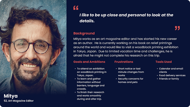
Goals:
To attend an exhibition on woodblock printing in Tokyo, Japan.
To learn and gather information without barriers, language and crowds.
To finish their research and works smoothly during and after the trip.
Frustrations:
"It is hard to get really up close to artworks when there are crowds.”
"Sometimes the labels are not printed clearly or large enough to read.”
"I only know very basic Japanese so I am not sure if I can get all the information I want.”
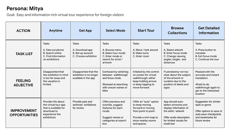
User Journey Map
Mapping Mitya’s user journey revealed how helpful it would be for users to have access to a dedicated Gyarari virtual tour app.
The Approach, Stage 2: Beginning the Design
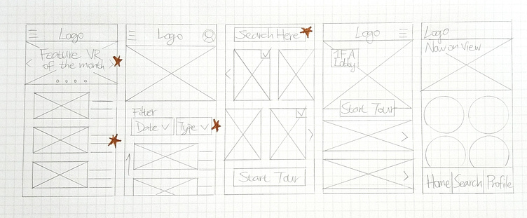
Paper Wireframes
Taking the time to draft iterations of each screen of the app on paper ensured that the elements that made it to digital wireframes would be well-suited to address user pain points. For the home screen, I prioritized a quick and easy searching process to help users save time.
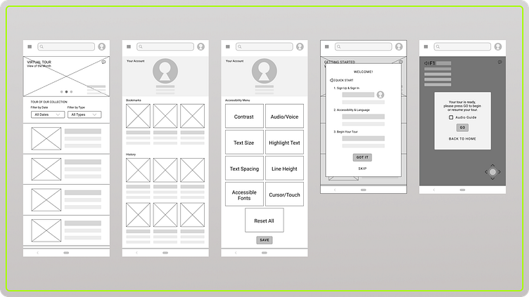
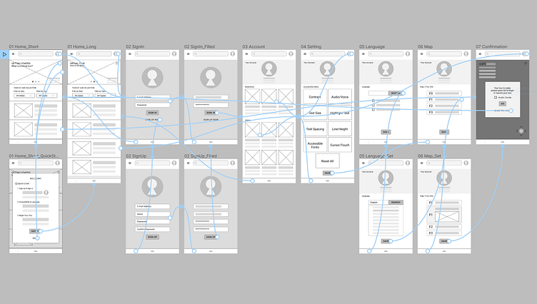
Digital Wireframes
As the initial design phase continued, I made sure to base screen designs on feedback and findings from user research.
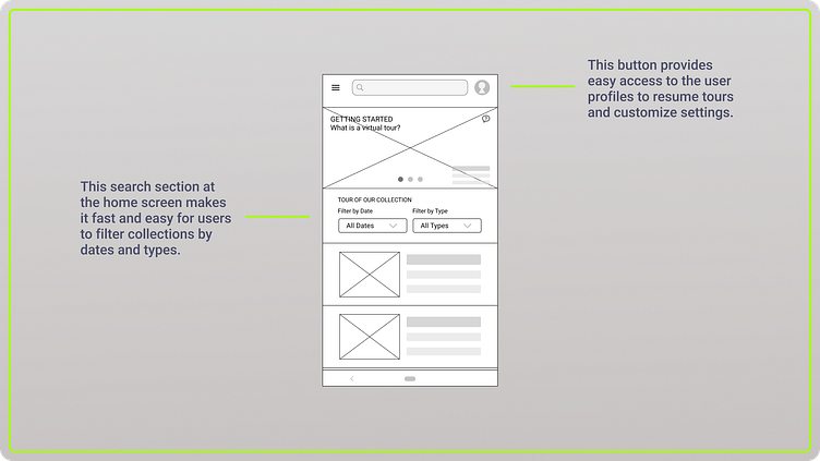
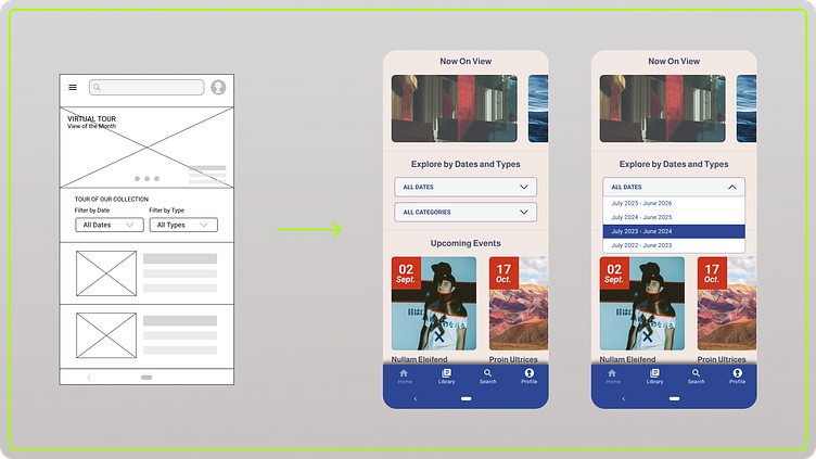
The search section on the home screen makes it fast and easy for users to filter collections by dates and types.
The button on the top-right provides easy access to the user profiles to resume tours and customize settings.
The search section on the home screen makes it fast and easy for users to filter collections by dates and types.
The button on the top-right provides easy access to the user profiles to resume tours and customize settings.
Digital Wireframes
As the initial design phase continued, I made sure to base screen designs on feedback and findings from user research.
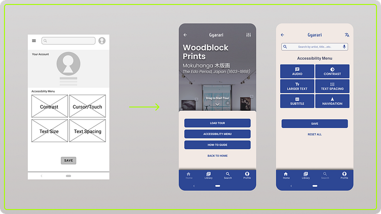
Accessibility and language support was key user needed to address in the design in addition to equipping the app to work with assistive technologies.
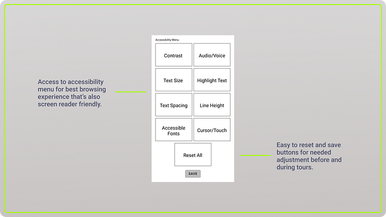
Access to accessibility menu for the best browsing experience that’s also screen reader-friendly.
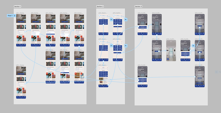
Low-Fidelity Prototype
Using the completed set of digital wireframes, I created a low-fidelity prototype. The primary user flow I connected was searching and starting a tour session, so the prototype could be used in a usability study.
View the Gyarari Low-Fidelity Prototype
Usability Study: Findings
I conducted two rounds of usability studies. Findings from the first study helped guide the designs from wireframes to mockups. The second study used a high-fidelity prototype and revealed what aspects of the mockups needed refining.
Round 1 Findings -
Users want to find exhibitions and start tours quickly
Users want better cues to log in or sign-up new account
Users want more accessibility options
Round 2 Findings -
Users want easy access to the navigation menu
Language setting should be separated from accessibility options
Users want built-in audio description features
The Approach, Stage 3: Refine the Design
Mockups
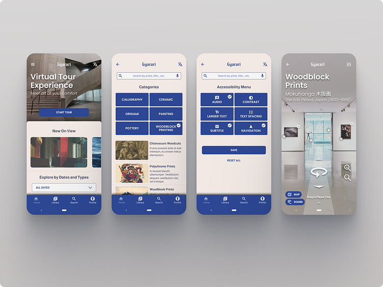
Early designs allowed users to search with a calendar, but after the usability studies, I simplified the search filter to choose date ranges and types. I also revised the design so users see current and upcoming exhibitions when they first land on the screen with Navigation Menu at the bottom.
The second usability study revealed frustration with the accessibility settings. To streamline this flow, I include an “Accessibility Menu” button as an option at the “Load Tour” screen. I also added the How-to Guide option to the tour confirmation screen.
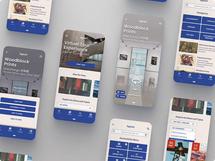
The Approach, Stage 4: Prototyping and Finalizing
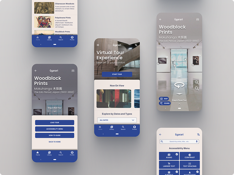
High-Fidelity Prototype
The final high-fidelity prototype presented cleaner user flows for searching an exhibition and starting a tour. It also met user needs for more consolidated screens with a bottom navigation bar for easy access.
View the Gyarari High-Fidelity Prototype
Below is a live demo of the final working prototype
Accessibility Considerations
Added bottom navigation bar for easy access and used icons to help make navigation easier.
Provided access to users who are hearing and vision impaired by adding a customization for accessibility settings on audio, color, and text.
Used labels and detailed imagery for exhibitions to help all users better understand the designs.
Conclusion and Takeaways
Impact -
The app makes users feel like Gyarari really thinks about how to meet their needs. One quote from peer feedback: “The app made it easy to learn and experience art anywhere anytime!”
What I learned -
While designing the Gyarari app, I learned that the first ideas for the app are only the beginning of the process. Usability studies and peer feedback influenced each iteration of the app’s designs.
Next Steps
Create extra screens and visual elements to stimulate more realistic and practical behaviors and experiences.
Conduct another round of usability studies to validate whether the pain points users experienced have been effectively addressed.
Conduct more user research to determine any new areas of need.
As always, thanks for stopping by!