Navigation Redesign
Overview
Members enrolled in an insurance plan can use our app to view insurance plan information. Members can view spending details, claim information and benefit specific information. Our app serves as a resource for members looking for their insurance information.
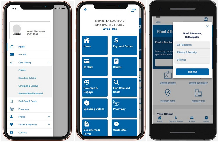
What was the problem?
The purpose of redesigning and architecting our new navigation scheme was flexibility. Our old navigation had nested items that would only work if the navigation they were nested under was also enabled/shown. This could be a problem for other customers who want to use our application that may not have specific functionality offered to their members. It didn't make it conducive for showing specific things to specific groups of members.
Why is this important?
Several of the members using our app could not find things. Our client (insurance company) had several complaints by members that they couldn't find their claims information. At that time, our claims was nested under the "Care History" section and that confused members.
During our redesign, the insurance company provided member data that was crucial in the naming of the new navigation items. We no longer had anything nested, but naming convention is crucial for members to use the app efficiently.
Audience
Members who are actively enrolled in an insurance plan with this insurance provider can download and utilize our app.
What did you do?
Changing the navigation scheme and entire architecture of our application was a group effort. The design efforts were significant, in making sure changes were reflected in the prototype and documentation. It required a lot of time and working through different scenarios and making sure we account for those scenarios or accounting for those scenarios in our backlog.
There were lots of conversations about naming conventions of the navigation tiles. We relied on our client to provide us with the feedback from their members so we could use that to drive names of items. Competitive analysis was also used to determine what other health insurance apps called specific things, like spending information.
Accessibility was a collaboration with our client and making sure our new navigation still followed AA standards.
What did you learn?
First, I learned a prototype will never be what’s coded or look like the end product. The biggest challenge with using prototyping tools is the viewports and components don't usually lay out as nicely as you might think. Seeing the navigation in development was a lot different than the design in the sense of spacing, colors, and we had challenges with the navigation being cards and possibly having large titles.
Secondly, communication is key when it comes to properly testing a new feature. There were several times the prototype had to be updated because bugs were logged by QA from the prototype not matching the developed product. We are still working through this process, because this part of it is still waterfall and the rest is agile.
Working fast, making a lot of on-the-fly decisions is always part of it. In the end, we were able to complete a huge piece of not only the navigation, but designing the navigation in a way where our developers can easily turn on and off features without worrying about nested/connected items.