Home App Concept
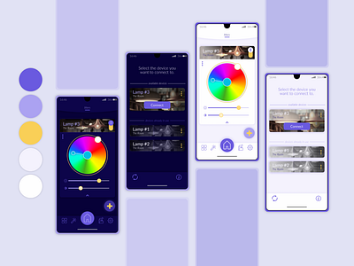
Color
Pastel colors were chosen to create a cozy and friendly feeling of the app with purple being the color of the year (Pantone Very Perry).
Yellow as color for details gives a little bit of extra warmth to the home app.
Design
The approach to design is fairly minimalistic, with only a few stylish details, in order to keep the app clean and clear, with all the commands easily accessible.
Photos are used to show the category of the device, in our case that being Lights.
Further down, in UX flow, you will see that a device can also have a compact preview where only name and the category are visible, together with the most important command - on/off switch.
