It's Spooky Season: Ghosted After a Design Test 👻🙃👻
How I turned rejection into a learning opportunity.
Yes, me. Rejected. Ghosted. Left high and dry. I haven’t been through this since I was in my early twenties on Tinder. Somehow I was able to get over that guy Wade, so I’m certain I’ll get over this. But just like dating, every failure is an opportunity for reflection and growth. So here it is - Reflection - Growth; for the whole Dribbble community to see! And maybe one day, I’ll run into this company and they’ll never know what they were missing. I'm assuming that’s how Wade felt anyways.
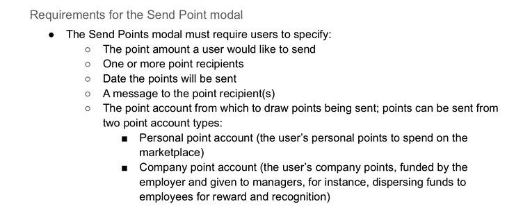
The company’s function is HR adjacent. It focuses on alternative benefits and employee satisfaction. As a person who works in state government, I found this very appealing. After my interview, I was really interested in working here, however we didn’t really get into the weeds on how their product works. Moving forward, I needed to complete a design test. I had just finished my Dribbble Product Design Certificate, so I knew I could create something, but wasn’t exactly sure what they were looking for. The business requirements are as follows:
Okay. Cool. Time to get started. Since time is of the essence (about 3 business days, but ya know, outside of my work hours) I decided to get started on creating a flow to work out some of my thoughts.
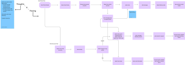
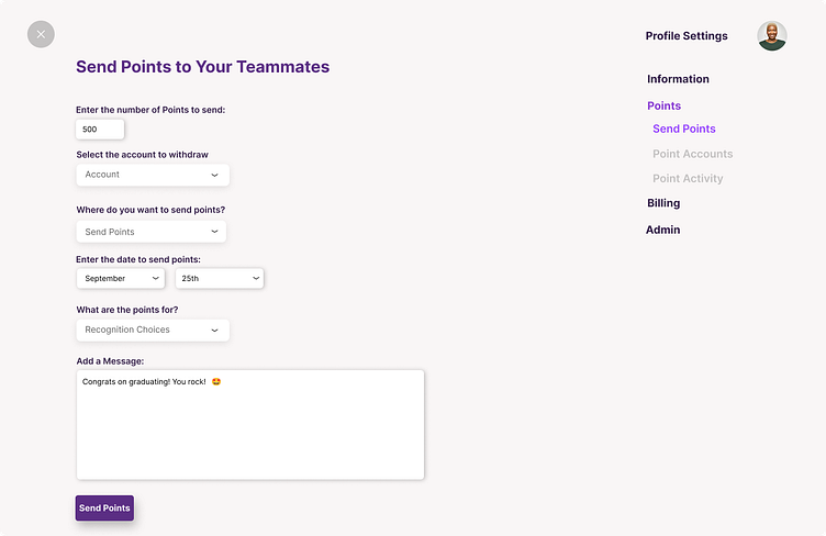
At this point, I’m thinking, ‘yeah, this is how you would send an amount of money to another person.’ I was drawing on Venmo for inspiration, Zelle, and even email since we want a personalized and communicative feature. So, I got to wireframing. I used what was sent to me as a launching point, and decided to continue using an F pattern Hirerarchy with customizable options. As evident from the sticky notes, I wasn’t fully committed to my choices, but I knew I had a few days to mull it over. I believe this was all done on the first night I got this assignment. Time-wise, I felt good. I was well on my way.


Okay, the next day. It’s time for the reflection period. It’s time for me to review my flow, review my wireframes, time to feel confident moving forward. Here’s the thing though, I don’t. I review my flow, I review my wireframes, and those sticky notes are still floating around in my head. and the self-doubt kicks in. “I’m not that great at Figma. I have to remember to keep designs as simple as I can because I don’t want to show them a feature I can’t probably build-out.” WOW, it really is a date! Remember when you were so focused on whether or not someone liked you that you forgot to be yourself?! You would just suck in your gut, eat a salad, and laugh at jokes you don’t think are funny.
Anyways, I hastily made choices that I thought they would like,. I focused on sticking to their established brand and tried to mirror what they had already created. Full speed ahead. But grimacing while I’m doing it.

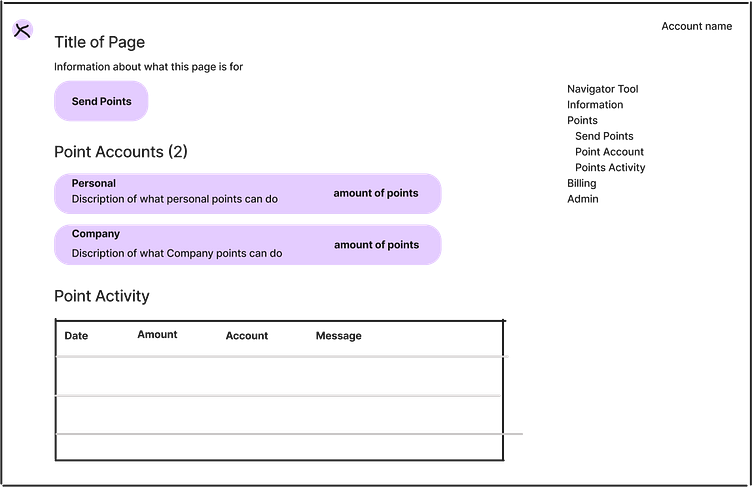
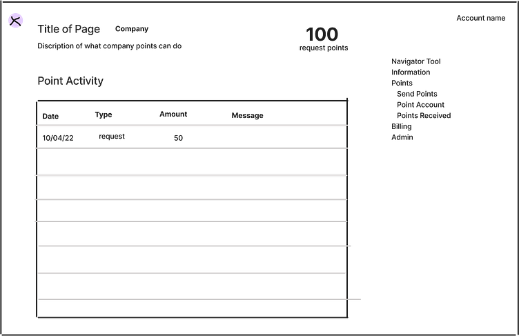
NGL, I still think this homepage looks great. To keep the dating metaphor going, it’s like looking back on your outfit and you’re like, “damn, I did look good though” Again, I was working with the Homepage they sent me and was unsure if too many changes would be insulting. So I made minor changes to have a better information architecture. Then kept it moving. I tried my absolute best to mirror their branding and keep the content friendly and informational.
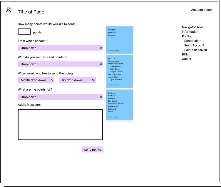
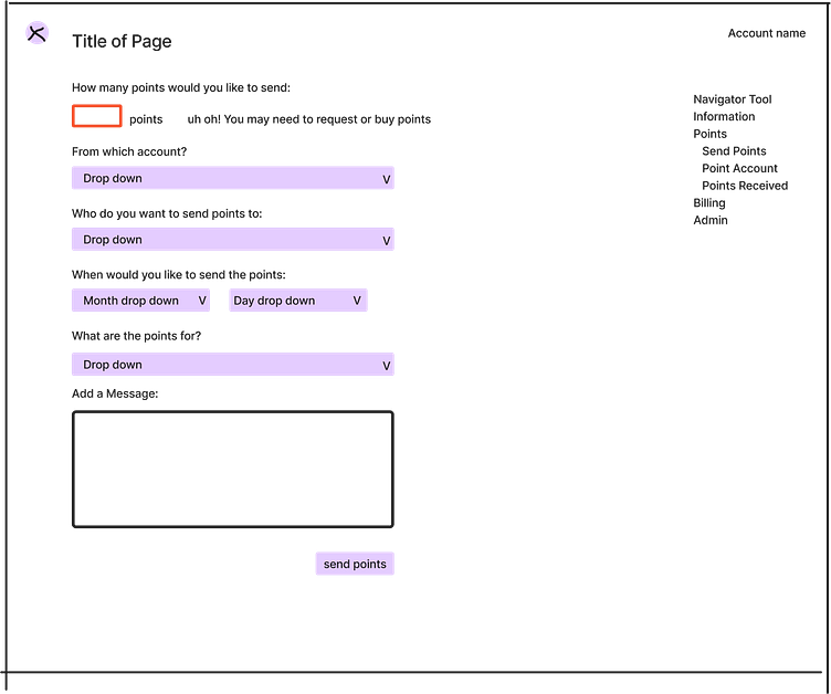
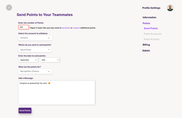
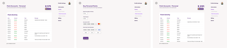
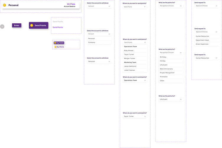
The business requirements were to make sure I could specify the number of points, make it known from which account, send to one or more people, and be able to add a message. I decided to do this more like google forms since this would be used typically in an office or business setting. I also wanted to make sure that the user could review everything they entered before selecting send. I would have loved to be able to create a flow where each input is a different screen and be able to test which is better for their user base. I think that it would have created a more fun experience, and the ability to really focus on each input. Perhaps a compromise would be to start with one of the inputs and reveal the next question when that answer is filled out. by the time the send points button comes up, they could review. Although I added the transaction to the Point Activity on the home screen. I think a verification page would have been helpful and rewarding for the user.

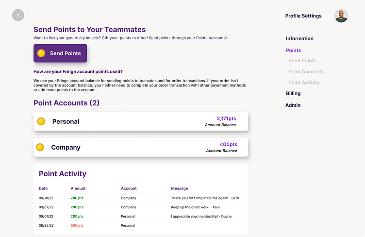
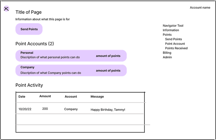
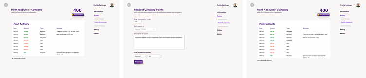
The thing about this flow is I thought I was going the extra mile. And you know what? Maybe I was! I mean, I think the Send Points feature already meets their requirements, so might as well blow them away with a whole other flow. Right?! (Still grimacing). I was personally confused about the difference between personal and company points. What is each for? Who has what? So I figured I could create some of my own clarity by explaining what each is for and the process of buying or requesting more.
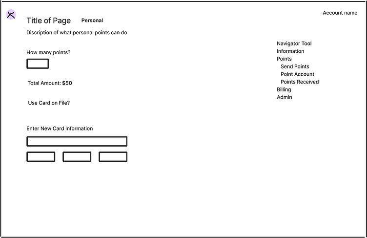
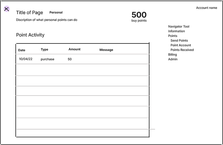
For the Request feature I was trying to create a more descriptive version of Venmo. I always loved the Request feature in Venmo; it’s petty but effective. For this product, you’d have to really advocate for yourself or your team as to why they need more points. And if this business is really about employee appreciation, I figured this would be a great addition. For buy points, I really just wanted to make an easy transaction flow. Again, both of these would have benefited from a verification page. Something like, “Purchase Complete” or “Request Sent!” would have increased user satisfaction and confidence.
Oh! Here’s a little component library I cooked up as well:
Well, anyways, you already know what happened. “They didn’t like me, they really didn’t like me!” But this isn’t a sad story. In fact, I’m kind of glad they didn’t. I realized I was uncertain about a lot of these steps. I want to go into a company with full confidence. I want to be able to at least get feedback on what I could improve on. I know this design could use work. I’ve already given myself different options to try. I’m new to the product world, and I know that. Before I dive into a relationship with a company, I have to date around. I have to put everything I have into it, and not know what went wrong, but instead be able to reflect, give myself feedback and see where I can improve.
Just like this long-winded metaphor, I am so much more than my relationship ---- er--- employment status.
I’m here to grow, get better, and enjoy the ride.
XOXO
