Help! I'm working for my mom!!!
Salon Website Redesign using UX principles and Wix
After hearing her complain for years about how she didn’t like her website, I decided I could use what I’ve been learning in my Google UX Design Course to at least enhance the User experience and interface. What I didn’t expect was to have learned more about how code-free websites work and how UX design principles affect meaningful change for a variety of businesses.
Background on my mom, her business, and the website
C’ville Styles is a small salon in Charlottesville, VA. The business is a sole proprietorship. Penny, my mom & salon owner, has declared herself as "not technically savvy." The data available on web visits and online booking percentages is not a top priority for her. She has never been pleased with her website as it didn’t represent the artistry or design elements her work entails. As much as she would like to do the website herself, she doesn't have the time or energy. She is focusing on adding a new stylist and moving locations.
“I want people to book online and have a website that is functional and reflective of the industry”
Problem Statement
Older women need to know which salon and service are right for them because they want to feel comfortable in the space and with themselves.
Users and Audience
The current average client is white women over 40 who work at least part-time. However, with the addition of a new stylist, their target demographic is full-time working women ages 25-40.
(Provided by C'ville Styles)
Roles and Responsibilities
I was the sole contributor to the website redesign. Of course, as C’ville Styles is the client/main stakeholder most decisions were first brought to Penny for approval. I completed research, design & copy changes, building out the website, and strategy moving forward.
Scope and Constraints
The research could not be funded, therefore relying on competitive analysis audits of other salons, google and yelp reviews, and general client information from C’ville Styles.
cvillestyles.com is hosted on a Wix premium account. The redesign was implemented using that platform.
Additionally, as C’ville Styles is run by one person, Penny’s availability for input and upkeep is minimal. The salon is 1.5 hours away from my location. I was gifted with ambiguous freedom.
Process List
1. Review the User Flow of the current website
2. Competitive analysis audit
3. Sketches and wireframes
4. Review and ideation of copy
5. Build
6. Results
Process - Review of User Flow and Interface of Previous Website
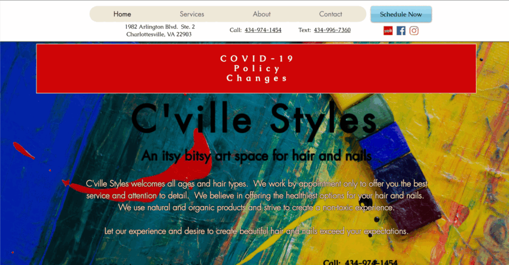
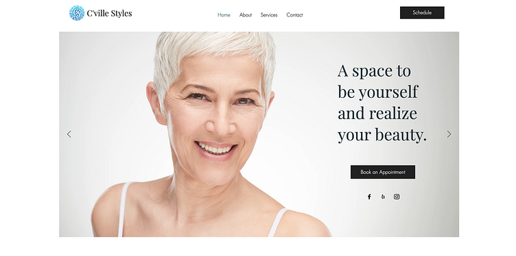
Below is her website prior to my involvement. From here I grabbed a majority of content information. I also wanted to create consistent font choices, increase white space, and guide the user to schedule an appointment.
Process- Competitive Audit
In the following spreadsheet, I found salons in the local area were not as advanced as I assumed they'd be. The most interactive and easy-to-use was actually the national chain, Hair Cuttery. The other salons definitely have a prettier UI but are still difficult to navigate and leave me with questions.
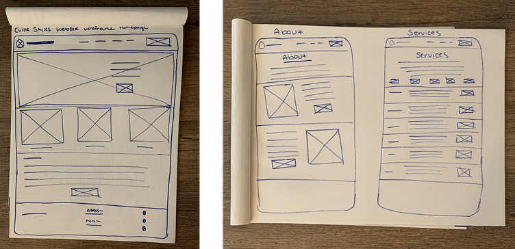
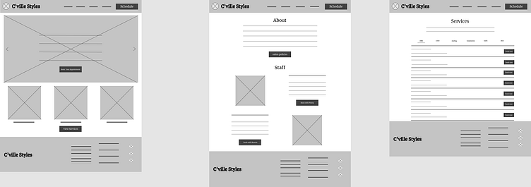
Process - Sketched and Wireframes
To begin the redesign, I wanted to focus on the functionality of the site and how everything should be organized. With the problem statement and goal for C’ville Styles in mind, I wanted to focus on having all the information in a more digestible way. Accessibility in word choice and readability were also key. I began work with pen and paper and later transferred my ideas to Figma for lo-fi wireframes. Since I will be using Wix, I had to make sure the designs were compatible with a template or could be designed on that platform.
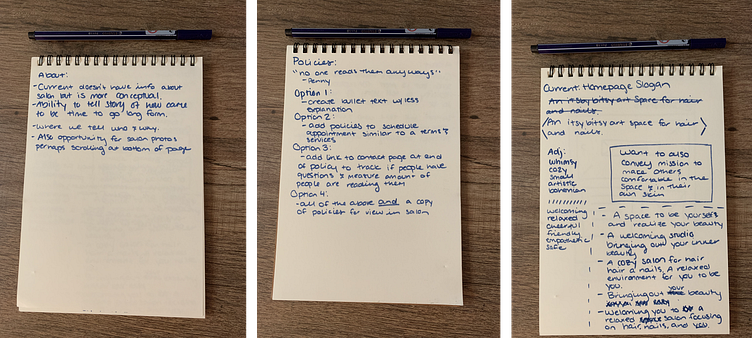
Process - Review, and Ideation of copy
The two users (new clients, and returning clients) have different reasons to go to the website. New Clients to buy into C’ville styles, and returning clients to schedule as easily as possible. I catered the long-form copy is catered to New clients, and microcopy is catered to returning users to navigate the schedule as easily as possible.
The three-word descriptions of the tone of voice:
1. Professional
2. Friendly
3. Direct
As Penny doesn’t have a huge interest in maintaining the website, I felt it important to make the copy and images evergreen.
Process- Build
As I mentioned, I'm working alone on this project. I am a UX researcher, and UX writer, I'm creating wireframes, and I'm deploying this site. After looking over the capabilities of Wix, I decided to start with a template and modify it to follow my lo-fi prototypes and match the copy as closely as I could. I also wanted to personalize the template enough so that it still felt seamless and unique.
Outcomes and Results
The launch was successful and the client was happy. From the redesign, there has been an influx of new clients, an increase in online booking, and positive feedback from current clientele. Additionally, this project really served to highlight C'ville Styles' need for brand guidelines and a digital manager to really utilize the website to its fullest capabilities. Overall, this went well and my job was done. 🙌🏻
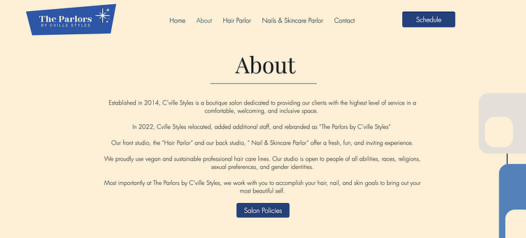
Until... nearly a year later, C'ville Styles began the process of rebranding. The salon had moved locations, changed its name to The Parlors by C'ville Styles, added a new stylist, and now needed a website update to reflect these changes. Since the client is my mother, I was put back to work.
Review of User Flow and Interface of Previous Website...Again
TBH, I did not want to do this. At this point in my life had a lot going on and was exhausted. I was in the middle of completing my Dribbble Product Design course, working over 40 hours a week in my job as a technical writer, having more social events as the pandemic restrictions became looser, and was just getting by trying to take care of myself, pets, and home. It was a lot. So, I figured, there wouldn't be much that needed to be changed, just a few image updates, and content updates, no biggie.
When I started reviewing the user flow, I definitely felt like everything was still working great, and considering her target audience, making a flow change may cause greater disruption. However, as I soon found out, just because the majority of the changes were visual, doesn't mean it wasn't quite the overhaul.
Content Changes
As I mentioned, quite a few updates have been made to the business, so I wanted to ensure accuracy above everything else.
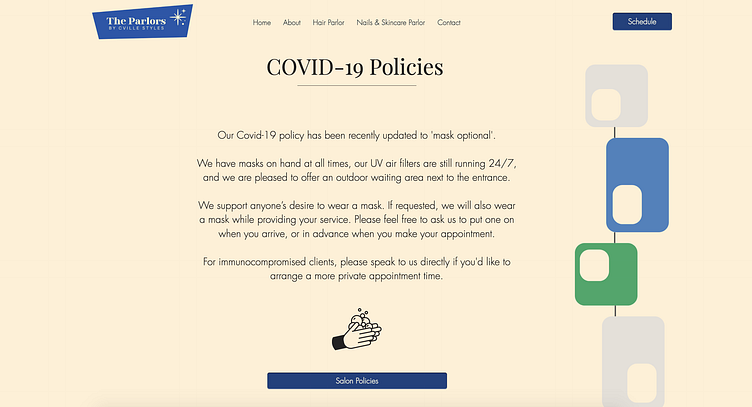
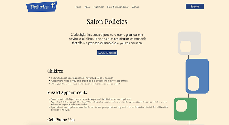
A majority of the updates were on the about page. Here I added information on the name change, updated Covid and salon policies, and added the new stylist image and bio.
With this new stylist came a whole bunch of new service offerings. The focus here was to make sure that the information architecture was digestible and easy to navigate. I did this by separating the services into Hair and Nail/Skin. In the physical space, there are two separate areas in the salon for those services, so it reflected the salon better as well.

Visual Changes
The Parlors by C'ville Styles is mid-century modern inspired. There are pictures on the wall of Audrey Hepburn and Doris Day, there is a lava lamp and Scandinavian-style furniture.
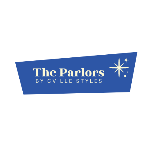
I began the visual changes by updating the logo. This is shown on the website, the signage in the physical space, and in any print media.
At first, I thought I could just add the logo to the site, make the content changes and update the font and colors. However, the more I played around in Wix, the less I felt like it reflected the business and Penny.
I ended up creating background art and creating some mid-century-inspired icons to really illustrate the recent brand and business changes. Only two fonts were used, these are the same fonts as the logo. I also incorporated employee images on the about page to add personality and build trust.
Additionally, I added new images to incorporate a variety of ages, races, and hairstyles in an attempt to attract additional clients for the new stylist. Finally, I ended up changing the background color to a muted yellow. I decided to do this o to accentuate the yellow in the logo and create a warmer and homier feel to the website.
Outcome
It took me a while..but when the website was finished (again), it felt much more reflective of the business. There still needs to be a digital manager, operations specialist, or intern to help her out. Although this was a great experience, I would like for my mom to just be my mom, not my client.
