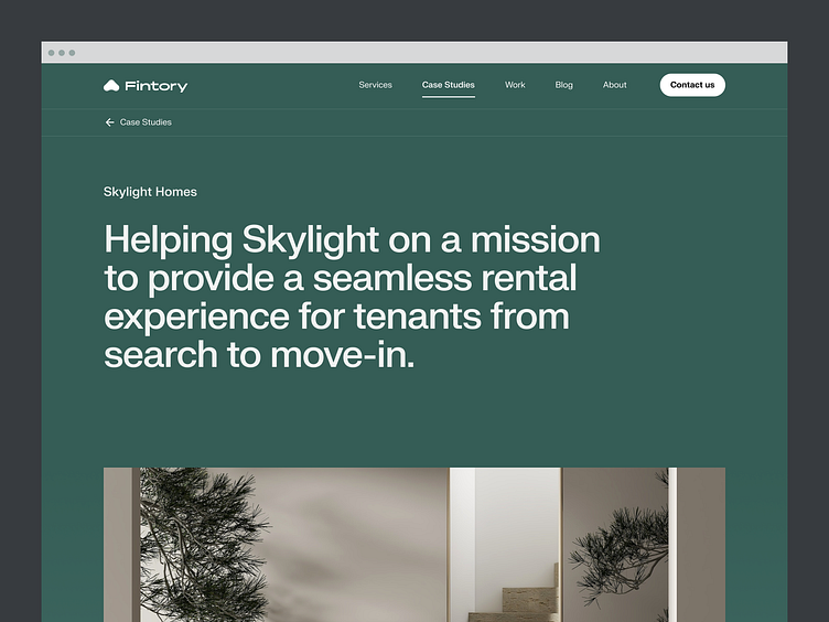
Skylight - Case Study
Hi all,
Skylight Homes is a technology-enabled marketing and leasing platform that makes it simpler for multifamily owners find the perfect tenant for their vacancy.
View Project ↗
Renovating brand and design
We were tasked to completely overhaul Skylight’s brand identity, create a new design language for their product suite, update their product design and UI/UX design, and create a new responsive design for their web/mobile platforms.
So basically, we had a project of great extent in our hands, which required elaborate planning, communication, and teamwork. That’s why we decided to visit our clients in L.A. and hold an extensive workshop, discussing ideas, approaches, and designs with them. The workshop included a discovery phase, where we have talked about the user flows of the platform and presented ideas from our side based on knowledge gained in previous projects.
The Process
We started the process by conducting market research to analyze Skylight’s competitors and their target audiences. The initial research helped us especially during the early conceptualization of the new brand and visual identity of Skylight - a crucial step when conducting a full rebrand and redesign of the product and platform.
Skylight Homes aims to transform the leasing and rental market by combining an exclusive network of residential agents with tour logistics technology to enable owners to quickly scale leasing teams, maximize occupancy, and streamline operations. The company provides marketing, leasing, and analytics services to its clients on a highly professional level.
Have it on-the-go
A key part of our work with Skylight Homes involved the design of a responsive web application. Following the principle of „mobile-first“, we created an experience that unites flexibility, efficiency, and aesthetic values.
The mobile web app had to display all the information the user would find on the desktop app - the list of buildings, leads, a calendar, and of course your own dashboard - while still maintaining a clear, user-friendly interface. To achieve this, we went for a simple and clean approach that adheres to our sophisticated design standards.
The result: an optimized user experience to have on-the-go.
____________________________________________________
🟢 Open for work.
I would love to hear about your idea.
📭 Reach out via mail: hey@kevdu.co
⚡️ Follow on Twitter for more detailed updates.
____________________________________________________


