Edit - Brand identity for online IT school

Knowledge is a treasure.
Presenting you the project of the IT school named Edit.
The naming choice was a result of the formation of a neologism from the words "education" and "IT", it has an easy degree of memorization and a simple phonetic structure.
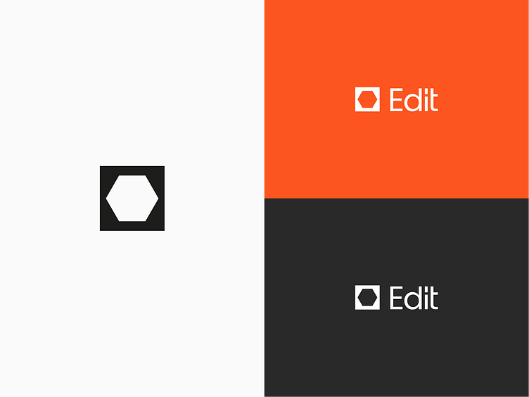
The logo represents a hexagon inscribed in a square in the form of a negative environment, which symbolizes the multifacetedness of IT as a sphere, and the square symbolizes the head or box, which contains knowledge from the IT sphere.
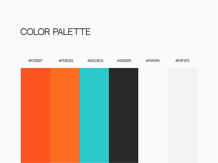
The colors are again chosen based on the diversity and contrast of the field, where orange symbolizes strength, determination and inspiration, turquoise symbolizes novelty, freshness and innovation of the field, and black and white are the fundamental colors.