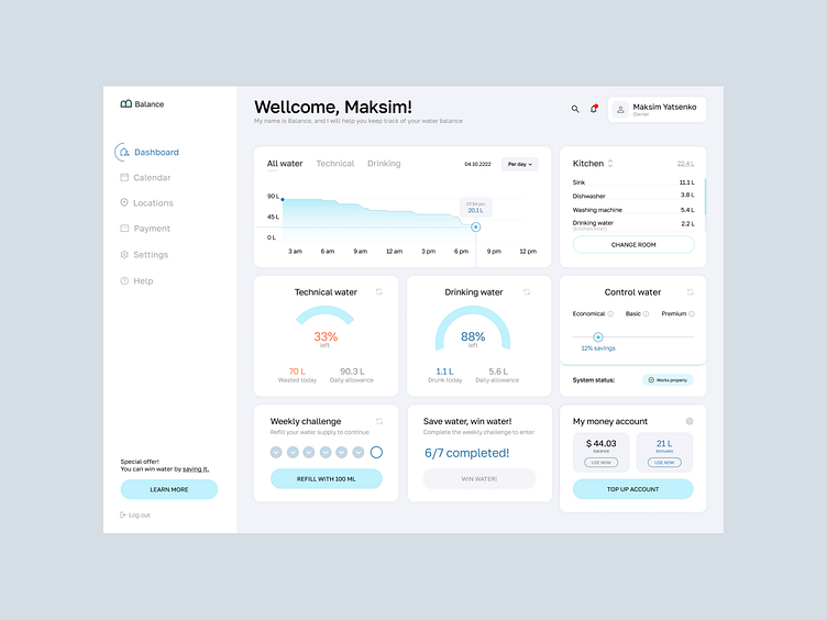
#29 Maksim Yatsenko | UX/UI Designer | Interface for Day Zero
Test task completed — October 5, 2022
Contact — @MaksimYatsenko (telegram)
Portfolio — https://maksimyatsenko.webflow.io
Our comment:
We did like the general visual direction. A bright, bot not overwhelmed one, with enough space within the blocks.But, complexly, there is lack of some more fresh decisions in data visualisation. Along with duplicating functionality. For example the graph copies the info with the consuming stats.There are concerns to prioritising functional blocks. And, to some mistakes with the spacings work and fonts (tabs, dropdown, and the title have the same level)
More by Lazarev. talents View profile
Like


