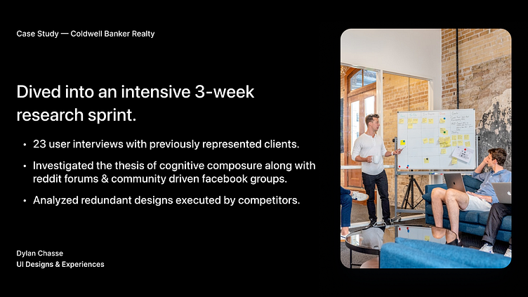
Coldwell Banker Case Study


Captivating Storyboards
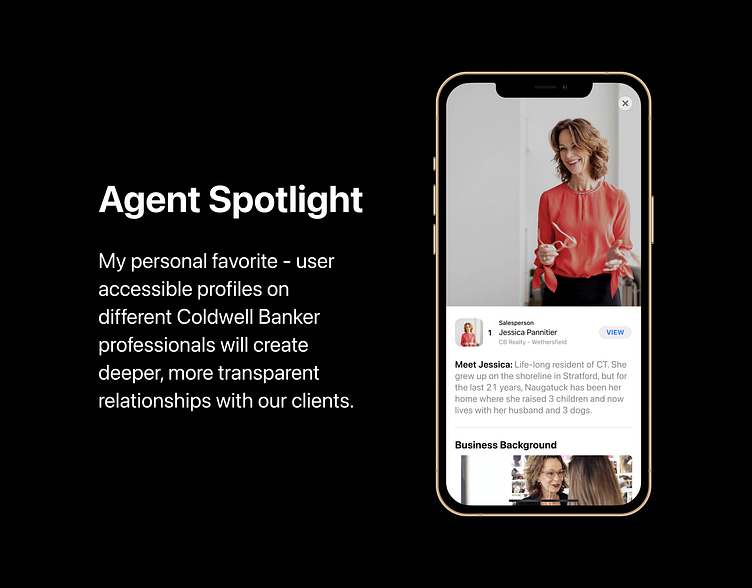
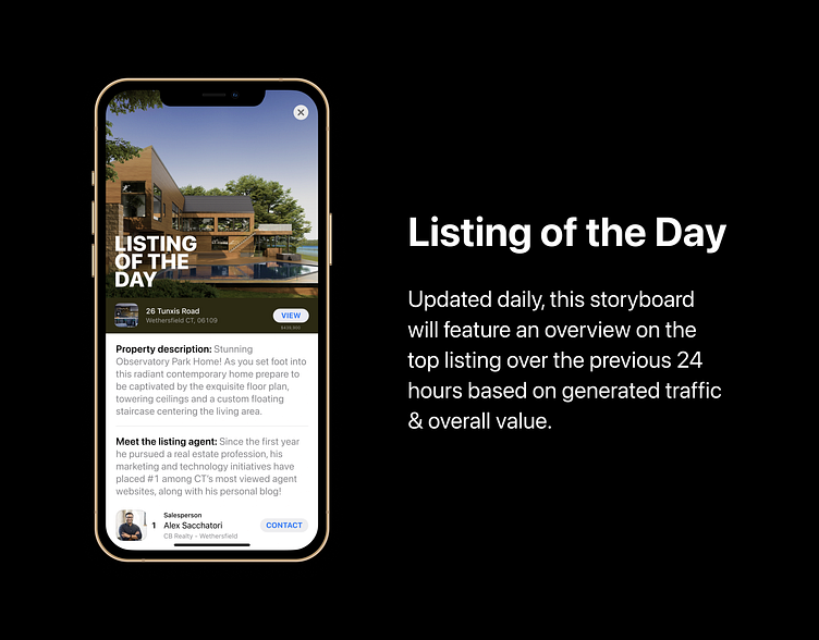
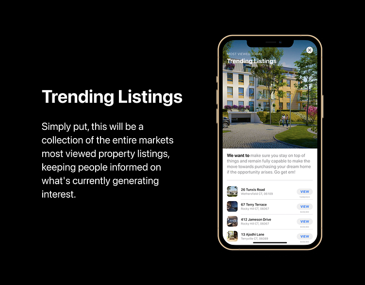
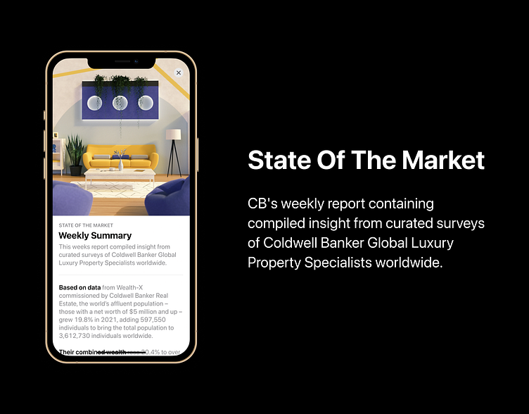
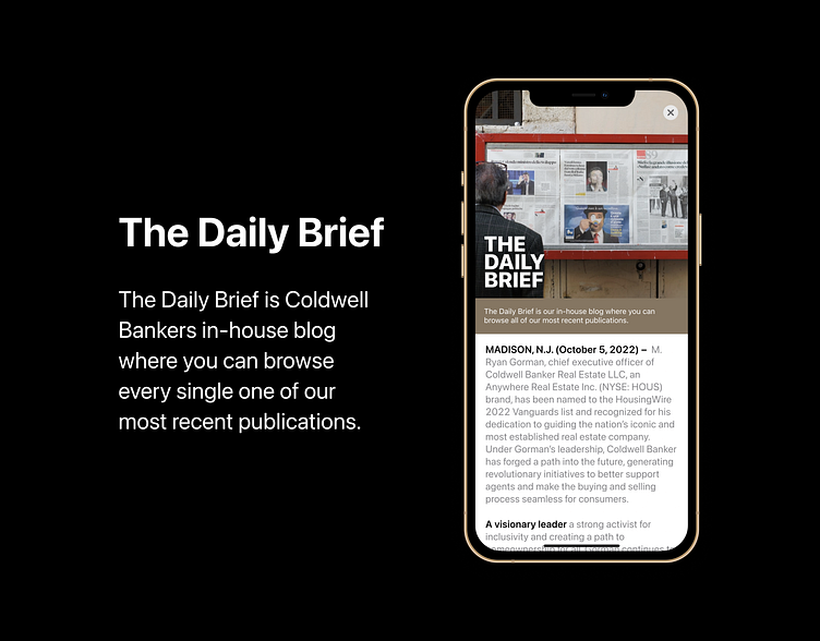
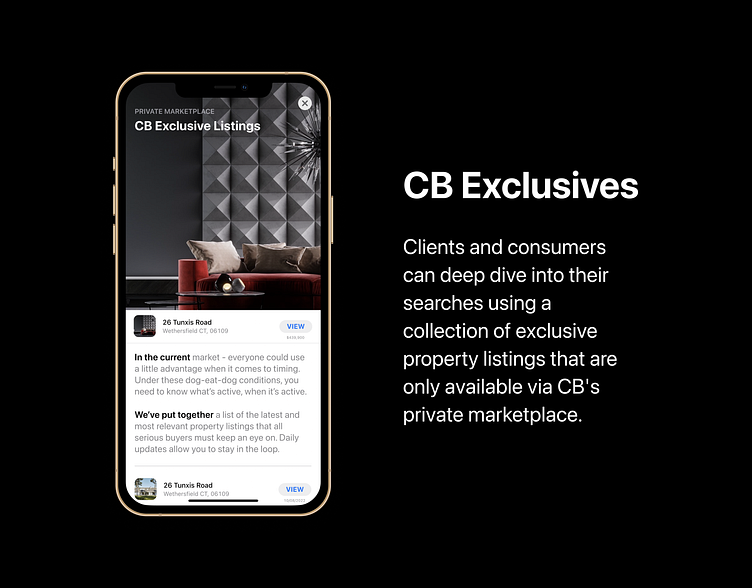
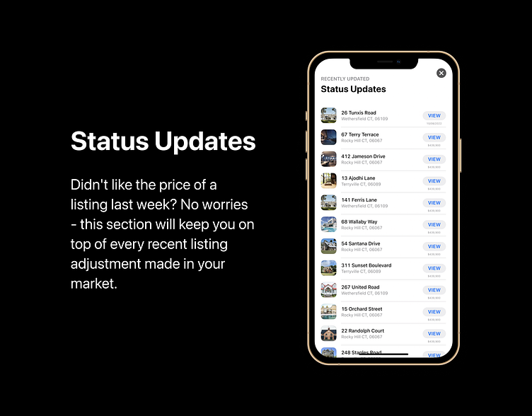
Daily updates on all things Real Estate & Coldwell Banker as a company. Vibrant storyboards packed with dynamic content and playful animation will keep users routinely checking in.
Multiple Listing Layouts
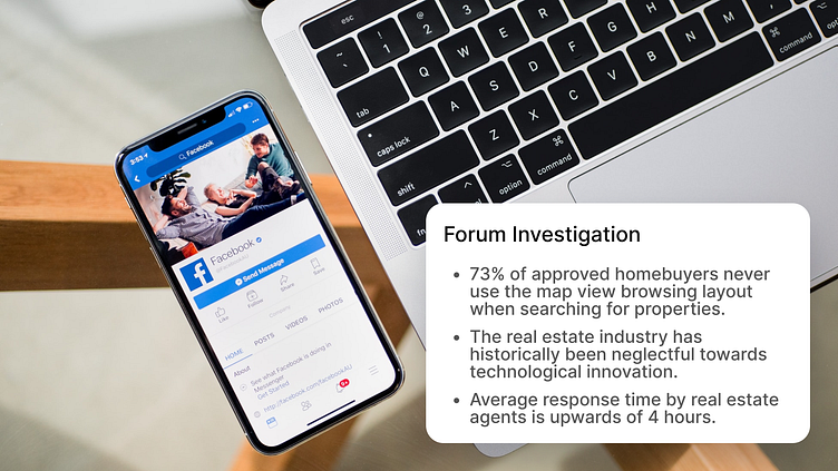
Fixing this problem wasn't exactly rocket science, considering it's already being implemented across some of the most utilized platforms across the globe. Something as simple as using a variety of content stacks while keeping only the most necessary information on display in each of the initial views results in minimized levels of cognitive overload - leading to a more pleasant browsing experience.
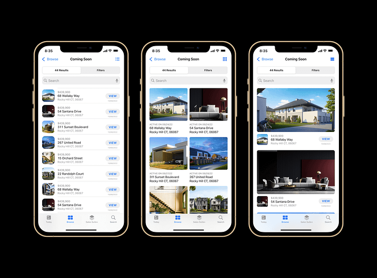
Simplified Content Architecture
Implementing a highly accessible filter layout using toggle buttons, & giving search capabilities to each category and it's respective views eliminates the need to include information that has already been entered as specific criteria.
Although the real gem of this experience is molded by granting the user this level of advanced customization through a single click process (with toggles) while keeping them on the same page that the results are being displayed.
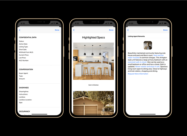
Placing the property details in a responsive popover was next on my list. The layout begins with the properties cover image, address details, and a full page image gallery - followed by widget blocks containing the number of beds, baths, square feet, acreage, list price, and listing status.
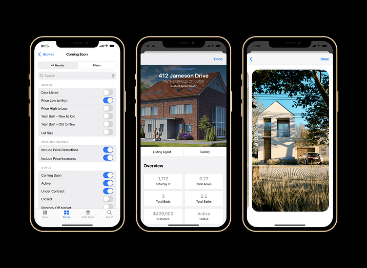
Giving the extensive set of details their own space in the content architecture allowed me to include every disclosed listing detail without overpopulating the initial page view. These data points are only relevant to seriously interested parties, so it makes sense to display them only when intentionally requested.
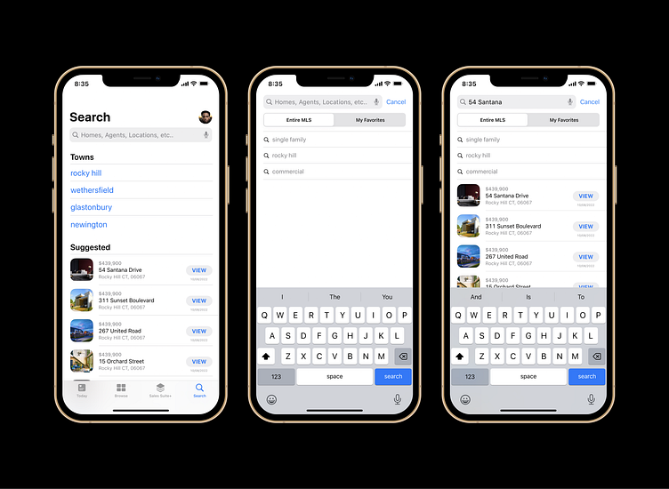
Distinct Search Tab
A widely shared misconception among the top real estate apps is confusing the users browsing experience with their searching experience. When attempting to locate a specific property, a user shouldn't be distracted by a screen crowded with content they have no expressed interest in.
I created a separate search page designed with ease of use in mind. Users can choose to search out of two categories - either their favorites/bookmarked listings, or the entire MLS. Simplicity for what should be a straight forward process to maneuver.
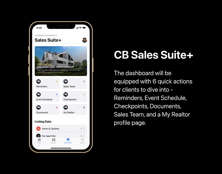
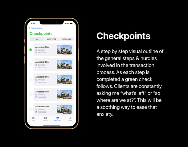
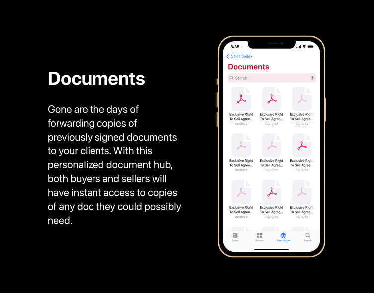
Accessible Client Dashboard
At this point in the process it was time for me to address the true problem at hand for consumers, the lack of on-demand accessibility as it pertains to the details of their contracted sale. I decided to put together a list of the most asked questions/requested information that my clients have brought up in the past, and build from there.
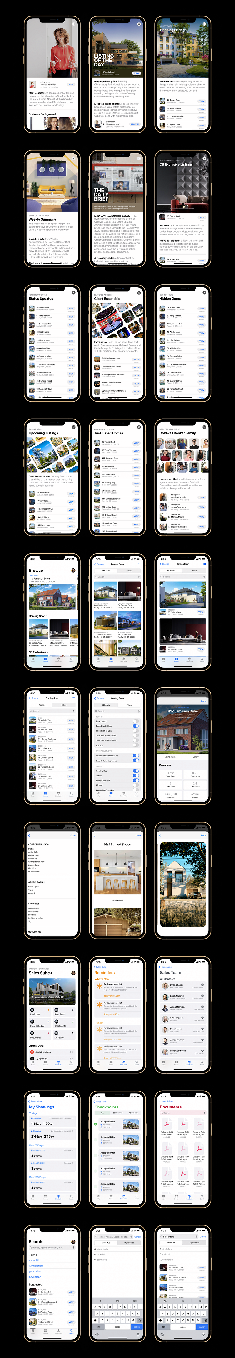
30+ Total UI Screens (Light Mode)
I am currently taking on design projects for new clients. I can also provide templated work with design guidelines if you prefer such a process. Feel free to contact me by Email, or SMS.
Let's chat: 👇
📩 Dylan.chasse@cbrealty.com
💬 SMS Mobile: +1 (860) 906-8681
Behance - Instagram - Facebook - LinkedIn
Best Regards,
- Dylan Chasse
© Copyright UI X DC Designs | All rights reserved.