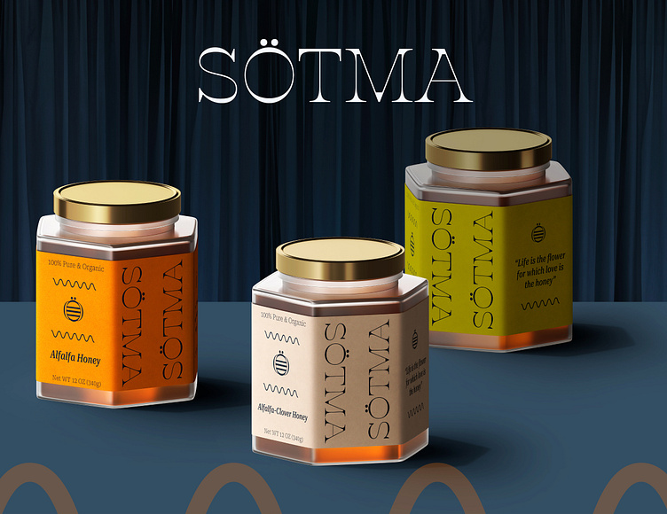
Visual Identity for SÖTMA Honey
About The Company
Founded in 2022, SÖTMA Honey Company is a family-owned and operated business
offering organic blends of honey products made on a private farm in North Dakota.
SÖTMA is the Swedish word for “sweetness,” and was chosen as the company’s name in honor of our founder’s grandfather, a honey maker who immigrated from Sweden to North Dakota in the late 1960’s.
SÖTMA Honey Company was created with the passion of generations of family
experience centered around a love for curating honey and sharing its sweetness with the world.
With distinct flavor blends such as Sunflower, Alfalfa, and Alfalfa-Clover, SÖTMA is committed to providing customers with high-quality and delicious honey because
we believe “life is the flower for which love is the honey.”
Client's Brief
Create logo and labels for a Honey Company. 3 different labels for 3 flavors: Sunflower, Alfalfa and Alfalfa-Clover Honey. Design should be Colorful and Eye-Catching, Minimalistic and Simple.
The Design
When honeybees want to inform each other of a nectar source, they use an extraordinary form of communication known as the "waggle" dance; a figure-eight pattern with a straight line created between the loops. The wavy lines seen throughout the design and on the packaging are inspired by this patterned dance. The movement of the lines communicates to the consumer, like the dance communicates to the bees, that there is an abundant source of nourishment nearby. SÖTMA Honey.
The wavy lines also complement the minimalist construction of the logo and bee symbol. The logotype looks as if it was dripped from a wooden honey stick onto the flat surface at the bottom of a glass jar. The logo is simple, elegant, and looks as appetizing as the products it represents.
The bee symbol is created directly from the letter Ö in SÖTMA. Unlike German, the dots atop the Ö are not an umlaut, which would indicate a sound change in the letter. Instead, Ö in Swedish is an entirely separate and distinct letter. Much like the three separate and distinct flavors offered by SÖTMA. The dots become the eyes of the bee and the stripes and wings are created by manipulating and transforming the portion of the underlying letter.
The color palette represents the pollens used to produce the honey, the sun that fuels the flowers and bees, and the soothing sensation these colors have when placed atop the amber-gold of the product itself.
The SÖTMA design dances with color, font, and language to communicate with and attract consumers.
THANK YOU!
Client: SÖTMA HONEY COMPANY
DESIGNED BY NIKITA MORAR
DATE: MAY 2022


