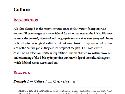
Meat Eater's Guide, Print Design
Designing for long form physical print media is a rather new experience for me. Fortunately, a lot of the same design principles for blog posts or article design apply. Don't most people go the other way around (print » web)?
I designed the book in Pages. The main body text is 11pt Minion Pro with a line-height of 1.4. Left and right margins are 1.75", top and bottom are 1.25" with a .5" header and footer.
Debating about a table of contents. Never met a TOC design I liked. Also, my tables in the book look atrocious—it's been so long since I've used tables I couldn't design one to save my life!
More by Jesse Gardner View profile
Like
