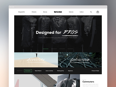
Incase Homepage Direction 1
At BASIC, I was given the opportunity to work on some initial directions for the Incase redesign. The second attachment was the initial direction that I took a bit more liberty with their brand, so that eventually made it's way back to the first one that's more true to Incase. I included a couple interactions I worked on as well. Im stoked with how the contextual lifestyle shopping sections came together to pair product listings with lifestyle imagery + a carousel to show multiple products per lifestyle.
There's a full case study on the project that our team extended far beyond digital and used design to drive their brand forward.
I have a couple more pages I worked on from this initial direction that I'll be posting soon, but really check out the case study for a comprehensive look at what our awesome team put together.


