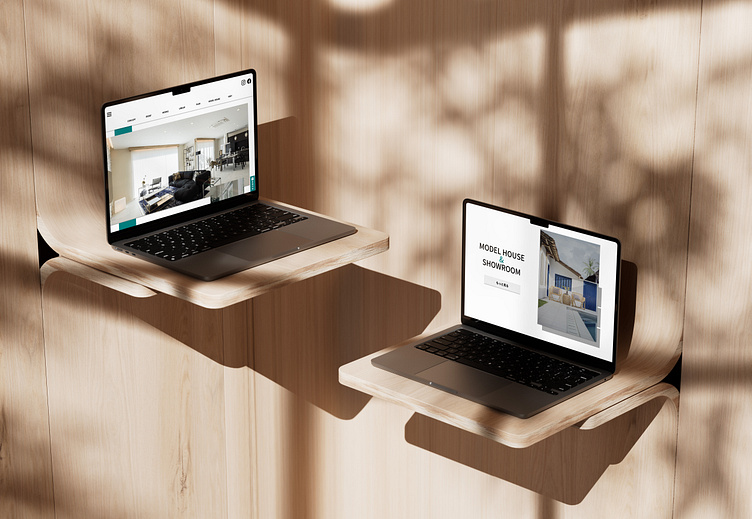
Real Estate Website Project (CASE STUDY)
In the summer of 2022, I had the opportunity to spend six weeks preparing ideas, wireframes and designs for a Japanese Real Estate company's new website.
While my time on the project was short, I gained a lot of valuable experience and enjoyed every moment.
In The Beginning...
When I first joined the project, information about the client's desires and requirements were scarce.
My initial briefing was that the client, an interior design company, was preparing to open their own real estate agency, and need a 10-page website that would attract customers and advertise their services.
The client shared some examples of their competitors' websites, and mentioned that they planned to add an e-commerce service to their website in order to maximise profits.
Therefore, my first week on the project was spent creating a site map and generating some colour scheme and layout ideas that could be presented at the first client feedback meeting.
Concrete Requirements
After the first feedback session, I was presented with a file that extensively detailed the requirements and desires of the clients.
The website would now consist of 30 pages, and while the main inspiration would continue to be the websites of the client's main competitors, they also wished to incorporate the stylish, chic look of 'Saturday NYC' and the refreshing, modern feel of Starbucks' most recent summer drinks campaign.
The main colour of the design would be teal, and the client stressed that customer engagement and lead generation had to be central to all aspects of the design.
With this information, I got to work creating two potential designs that the user could choose between at the next feedback meeting.
A Website Is Born
The client took a few days to compare my designs, and then let us know that they wanted to proceed with design A.
As the final stage of my involvement in the project, I was then tasked with creating wireframes for all the website's pages (including a site map and 404 error page) that could then be passed on to the company's in-house UI/UX Designer.
While the homepage design incorporated a scrolling teal bar that would move as you explored the page, I decided to keep my designs for the other pages more simplistic, with paper-like grey elements and teal highlights used sparingly for emphasis.
In Conclusion
Whilst I would have loved to have followed the project until completion, I greatly enjoyed the six weeks I spent working on the website and left having learned some very valuable lessons.
Not only did I get to experience receiving client feedback, working to deadlines and building around requirements, I also had to spend a lot of time working on ways to incorporate ideas and concepts into my designs that I may not have agreed with, and I found myself working quickly to meet new, sudden requirements and demands that I had not anticipated throughout the process.
After six weeks, I left the project feeling even more determined to build a career in UI/UX design, and inspired to work on improving my own skills even more.


