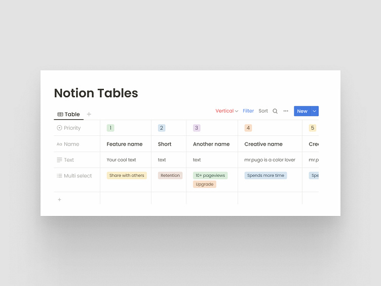
Vertical Properties for Notion
MINI CASE STUDY
One of the main pains of Notion.so users is the limitation to create horizontal tables only(especially for mobile users). Only horizontal tables make it difficult to scroll because most people have a regular mouse with no horizontal scrolls on it, and they have to do it manually and use the horizontal scrollbar in the interface, which most of the time is out of reach and needs a few vertical scrolls to be able to use it.
On mobile devices, it may be more inconvenient. Due to the fact they don't see most of the properties in one view and they have to do lots of swipes to left and right to scan the whole table.
Vertical properties in tables are way more user-friendlier on mobile devices, their visibility is higher on all devices, and when users start to scroll they won't disappear from the screen quickly.
A locking feature for properties main title would be a good idea too. In this way, the user can scroll too far right(vertical tables) or to the bottom(horizontal tables) in the tables, but they don't need to get back too far left/top to find out which property they are looking at.
----------------
AVAILABLE FOR NEW PROJECT
----------------
My Services:
• • • • • • • • • • • • • • • • • • • • • • • • • •
