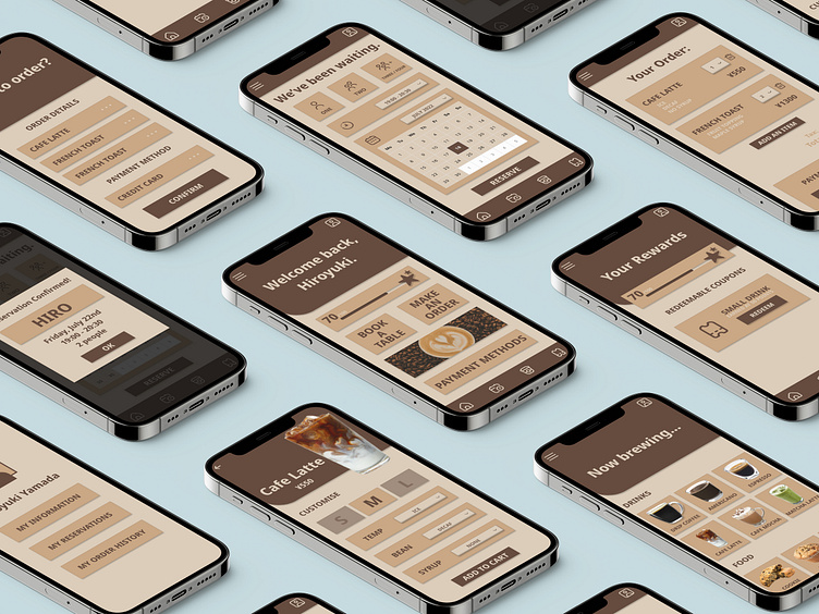
Cafe Loyalty App Design (CASE STUDY)
Created in 2022 as part of my coursework for the Google UX/UI Design Certification, this cafe loyalty app was the result of two months of wireframes, prototypes, user studies, insight-building, accessibility research and learning how to use Figma.
Understanding The User
For the first part of the project, I spent time researching the common 'pain points' experienced by cafe users in Tokyo, Japan.
I then combined that research to create user personas, problem statements and user journey maps which could be used for the project.
Planning The Design
Next, I started to ideate and sketch the design for my app.
After drawing out some basic wireframes by hand, I then used Figma to create digital designs which could be used as low-fidelity prototypes for upcoming usability studies.
Usability Studies And Insights
Before beginning the usability studies, I felt that my design was highly intuitive and easy to navigate. However, this wasn't entirely true.
Usability studies conducted in Tokyo with five participants lead to the discovery of user flow disruptions and the generation of several key insights which allowed me to improve the design and make it easier to use.
Completing The Design
Building on the insights and feedback from the usability studies, I created detailed mockups on Figma which could be used as high-fidelity mock ups.
As I worked through my design, I tried to keep in line with accessibility recommendations, which impacted everything from the gestures used to colour contrast.
Conclusion
Working on this project allowed me to experience all stages of the UX/UI design process, and to develop new skills such as usability testing, accessibility adaption, insight gathering, and how to use Figma.
While the design could definitely be improved in the future to make it even more accessible and user-friendly, I'm very pleased with what I achieved in the space of two months.


