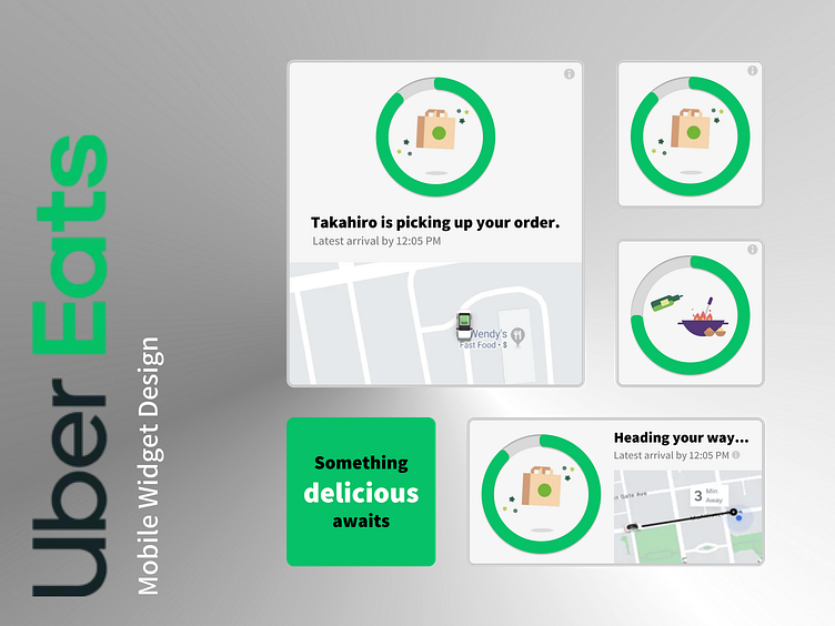
Uber Eats Mobile Widget Design (iOS)
Notifications are out, widgets are in.
Tokyo is home to countless unique restaurants and intriguing, delicious dishes, and there's nothing I enjoy more than ordering something new and exciting to be delivered straight to my front door.
With its' iconic green loading screen and simple, image-heavy navigation, I'm a really big fan of the Uber Eats app, and prefer it over some of the more popular Japanese delivery app alternatives.
However, there is one thing that I find a bit frustrating about Uber Eats - the constant notifications.
Each time my meal gets closer to my front door, I receive a new notification. The notifications guide me to open the Uber Eats app and track the meal's status; a somewhat unnecessary process thanks to the concept of 'widgets', which are now commonly found on the majority of modern smart phone devices.
One day, as I clicked through the app to track my delivery, I decided to try my hand at designing an Uber Eats widget that would look at home amongst the others on my iPhone.
This was the result.

