150th anniversary of Akureyri
On the occasion of the 150th anniversary of Akureyri, a competition was held for the logo of the anniversary year among students at the art design department of the Art School in Akureyri.
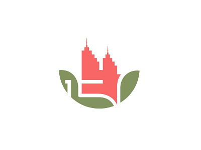
The image consists of the numerals "150" in negative form. Akureyri's main landmark is also at the top, which is displayed in a heart-shaped form with a reference to the town's traffic lights, which you can clearly see when driving in the town. The green color represents nature and the shape indicates all the slopes that are in Akureyri, which according to the designer are quite a few.
But the simplest thing would be to just say that the image is a semi-pixelated version of a red rose.
More by Pétur Örn Pétursson View profile
Like
